| Author | Thread |
|
|
06/09/2011 07:28:33 AM |
Haha. Better luck next time! :)
Unknown to myself the average of all my entries has just the thing you're looking for!

|
|
 Photographer found comment helpful. Photographer found comment helpful. |
|
|
06/08/2011 08:56:31 PM |
|
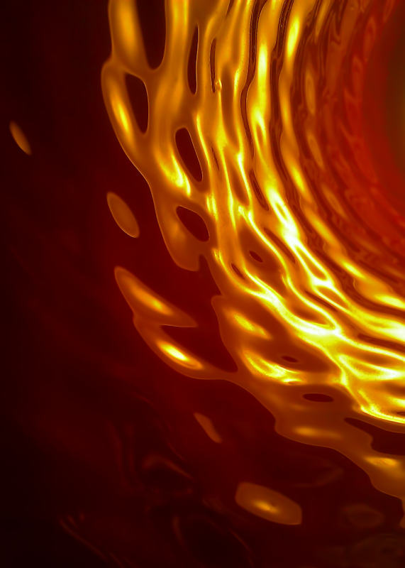
Hm... I think this is really a cool shot. I didn't vote, but would've probably given this a 7. I'm particularly fond of the way the shapes seem to be made out of some fluid... the way the tones are rendered really aids in that. Not quite enough for a favorite from me, but much appreciated. You chose well to shoot this shot with a camera phone; I've a feeling that the lack of super crisp detail and color rendering helped this one turn out the way it did. |
|
| Photographer found comment helpful. |
|
|
06/08/2011 07:11:12 PM |
Yes, we must have swopped bodies. Enjoy the nightmares dude!
Cool abstract though! Looks like a sunspot. I like it! (also, cheers for pointing out the Dragon/Damsel fly thing. I didn't know the difference. |
|
| Photographer found comment helpful. |
|
|
06/08/2011 06:21:50 PM |
Sorry man, but I would have given it a five. I love an abstract, and this is quite nice with the depth and pulsing motion, but there's a great deal to it that has me wondering if someone just hasn't gone haywire on the sliders. There's enough smooth gradation to make me think it's not just knob twiddling for twiddling sake, but there isn't enough of a feel to the image to convince me the photographer has any connection, or that I should spend time to find a connection. Right about middle is how I see it as presented on its own.
Interestingly, one of the things I do not like about it is the color. It's just a bit jarring to me, and I prefer my abstracts more subtle, almost mysterious. I bet if you'd gone grey tones you'd get a lot more love its. |
|
| Photographer found comment helpful. |
|
|
06/08/2011 12:42:10 PM |
I think I already told you this, but I'll repeat it anyway... :D
The first time I saw it, I thought it was glorious and would have given it an 8. Now, for some reason, it just doesn't seem to glow as much as when I first saw it. It almost makes me curious whether it's daytime or nighttime viewing differences. |
|
| Photographer found comment helpful. |
|
|
06/08/2011 12:06:12 PM |
|
You can put me in the 'love it' category, but I gan certainly see how someone could hate it, too. I'm surprised you got so many "meh" votes. |
|
| Photographer found comment helpful. |
|
|
06/08/2011 10:44:44 AM |
|
This is nice - you gotta work harder on the 'hate it' part ;-) Something's not working for me with the orientation or composition - I want to go into the tunnel on the right and I can't. But, you've got lovely colors, well controlled highlights (in context), and the swiss cheese effect is kinda cool. For me, the best abstracts are subliminally suggestive of something representational, this allows a toehold of a sort. |
|
| Photographer found comment helpful. |
|
|
06/08/2011 10:00:47 AM |
|
They don't like abstracts and they don't like fish either. ROFL! |
|
| Photographer found comment helpful. |
|
|
06/08/2011 09:44:51 AM |
I found the 'space' on the left uninteresting so gave you a 5 :-P
If the brighter area covered more I think I would have preferred that. |
|
| Photographer found comment helpful. |
|
|
06/08/2011 01:38:19 AM |
|
It appealed to me. I was one of your 8s. |
|
| Photographer found comment helpful. |
Comments Made During the Challenge  |
|
|
06/01/2011 10:32:21 AM |
|
I like this and I'll be interested to see if the artist behind this image lets us know how it was achieved (I'm a noobie, no clue about lighting anything). |
|
| Photographer found comment helpful. |
Theme:
Classic /
Light /
Dark
Home -
Challenges -
Community -
League -
Photos -
Cameras -
Lenses -
Learn -
Help -
Terms of Use -
Privacy -
Top ^
DPChallenge, and website content and design, Copyright © 2001-2026 Challenging Technologies, LLC.
All digital photo copyrights belong to the photographers and may not be used without permission.
Current Server Time: 10/13/2026 10:58:37 AM EDT.






 Add photograph to your favorites
 Add photographer to your favorites


