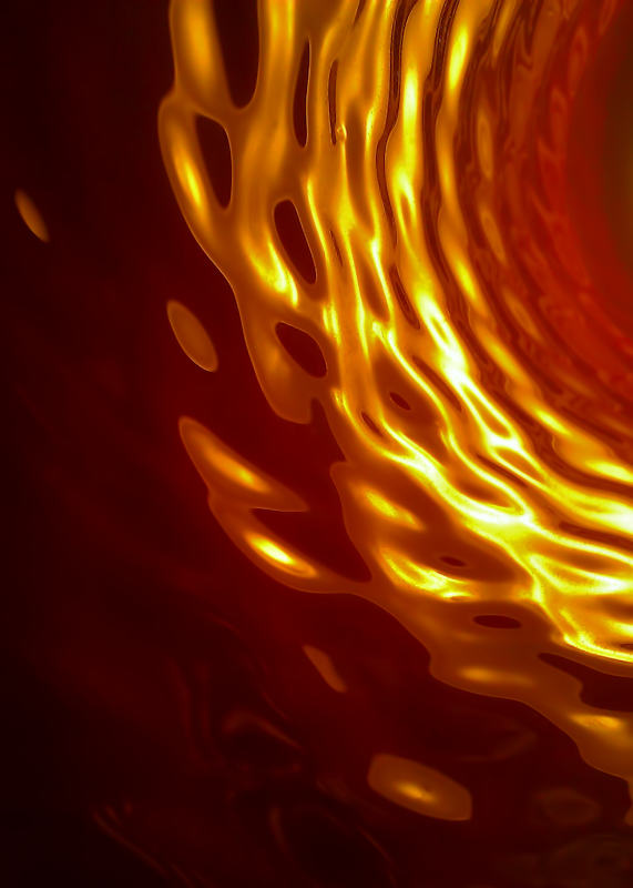
Shooting for my goal of a love it or hate it entry with this. I want anything but 5's. Abstracts tend to not get a lot of mass appeal outside of abstract specific challenges. Though there are a fair number of people that do like them, it's not a critical mass. I had originally shot this for the cameraphone freestudy, but entered something a bit more identifiable that did reasonably well. My other choice for this month's FS was one of my "old timers with big mustaches" shot, and I wanted to do something a bit different this time.
Anticipating a high 4 to low 5 out of this, and hoping for some good comments. I did have this posted in the outtakes thread for a little while, so I expect some people to recognize it, but hopefully they will not recall whose it is.
Post-Challenge notes:
Too many darn 5's. I missed my goal by a long shot and only pulled in one appreciative comment. I thought it was a pretty good abstract, but didn't really nail the strong appeal with many people, not even the usual "out of the box" crowd. Abstracts are really a hard sell with the DPC crowd.
Well, a lot of good feedback post-challenge. Thanks! We'll see if I can nail it next time. Perhaps that should be a new goal of mine: A 6+ with an abstract in a non-abstract challenge.
Oh, and if anyone is interested in what it is, it is the interior of a hanging lamp in an Arby's fast food restaurant.
Statistics
Place: 257 out of 344 Avg (all users): 5.2366 Avg (commenters): 8.0000 Avg (participants): 5.1250 Avg (non-participants): 5.5429 Views since voting: 1040 Views during voting: 208 Votes: 131 Comments: 11 Favorites: 0
Hm... I think this is really a cool shot. I didn't vote, but would've probably given this a 7. I'm particularly fond of the way the shapes seem to be made out of some fluid... the way the tones are rendered really aids in that. Not quite enough for a favorite from me, but much appreciated. You chose well to shoot this shot with a camera phone; I've a feeling that the lack of super crisp detail and color rendering helped this one turn out the way it did.
Sorry man, but I would have given it a five. I love an abstract, and this is quite nice with the depth and pulsing motion, but there's a great deal to it that has me wondering if someone just hasn't gone haywire on the sliders. There's enough smooth gradation to make me think it's not just knob twiddling for twiddling sake, but there isn't enough of a feel to the image to convince me the photographer has any connection, or that I should spend time to find a connection. Right about middle is how I see it as presented on its own.
Interestingly, one of the things I do not like about it is the color. It's just a bit jarring to me, and I prefer my abstracts more subtle, almost mysterious. I bet if you'd gone grey tones you'd get a lot more love its.
I think I already told you this, but I'll repeat it anyway... :D
The first time I saw it, I thought it was glorious and would have given it an 8. Now, for some reason, it just doesn't seem to glow as much as when I first saw it. It almost makes me curious whether it's daytime or nighttime viewing differences.
This is nice - you gotta work harder on the 'hate it' part ;-) Something's not working for me with the orientation or composition - I want to go into the tunnel on the right and I can't. But, you've got lovely colors, well controlled highlights (in context), and the swiss cheese effect is kinda cool. For me, the best abstracts are subliminally suggestive of something representational, this allows a toehold of a sort.
I like this and I'll be interested to see if the artist behind this image lets us know how it was achieved (I'm a noobie, no clue about lighting anything).






 Add photograph to your favorites
 Add photographer to your favorites


 Photographer found comment helpful.


