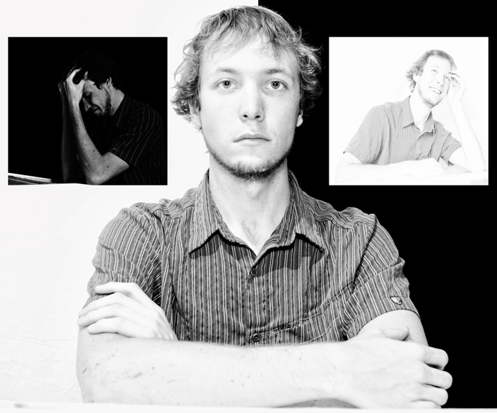
I normally don't do portrait work, and I'm normally not a model either, but both came to be on this one. I figured if I was going to try something new by entering a portrait, I might as well try lots of new things, and went ahead and attempted a high key and low key version, to show the spectrum of life. I also got to try out my new 24mm 2.8, which was fun, as well as some neat lighting technique. Too bad my girlfriend is in New Zealand, she's way way easier on the eyes...
Note to self: expect to spend more than 2.5 hours when you are taking and editing three photos in styles you don't normally do. Yes, I know there are crappy wrinkles in my crappy $4.00 white backdrop. I didn't have time to get nice material like the black velvet, nor time to fix those wrinkles and still take the photos.
Post challenge:
The center photo was as bland and lacked contrast because I had to boost curves some to get the white side to blow out in some areas even though I used a separate flash on it. I didn't have enough time to set up another flash to help it out a bit. Same thing goes for the whole "not exactly centered" thing. Details take time... and I didn't give myself much. Still a good learning exercise. Thanks for the comments.
Statistics
Place: 126 out of 149 Avg (all users): 5.0360 Avg (commenters): 5.5000 Avg (participants): 4.9733 Avg (non-participants): 5.0629 Views since voting: 1385 Views during voting: 434 Votes: 250 Comments: 9 Favorites: 0
ha - look at young Derek! I have to say tho, I really like that picture on the right. It seems so very natural. What a wonderful smile. This is very creative!
This is a great study in contrast, and for me very well suited to the challenge. It's one of those shots that's probably a bit too clever for the voters and I think you may have suffered from some people not seeing it as a "traditional triptych".
I don't agree with the others on the "centre you" being overexposed, what I do think though is that because of the high exposure that the out of focus arms take away slightly from the shot.
The concept itself is very good, I like the idea of a spectrum of emotions. The positioning of them reminds me of the angel / devil on my shoulders thing and makes the image suggest that the high and low emotions are somewhat like those, each tempting you towards them in their own way.
The two smaller photos are very interesting, with the happy high key and sad low key.. The center one less interesting, as the look is a bit vacant and the tones flat. Focus may be a little soft as well.
Interesting use of black and white backgrounds. Not sure I'd have had the smaller poses oriented to the edges of the image, rather than towards the central subject. Normally arrangements like this leave a too large gap in the lower sides of the main image, but you've avoided that nicely.
I feel you've overdone it a bit on the darks and lights. Furthermore, I would have liked the divide between white and black right above the middle of the face. Like often, the devil is in the details.






 Add photograph to your favorites
 Add photographer to your favorites

 Photographer found comment helpful.


