| Author | Thread |
|
|
01/25/2012 10:57:57 PM |
|
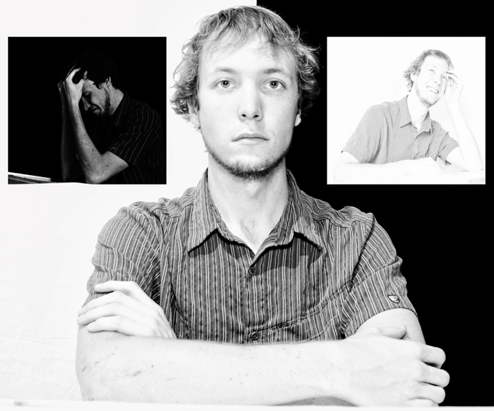
ha - look at young Derek! I have to say tho, I really like that picture on the right. It seems so very natural. What a wonderful smile. This is very creative! |
|
 Photographer found comment helpful. Photographer found comment helpful. |
|
|
03/04/2010 07:01:38 AM |
This is a great study in contrast, and for me very well suited to the challenge. It's one of those shots that's probably a bit too clever for the voters and I think you may have suffered from some people not seeing it as a "traditional triptych".
I don't agree with the others on the "centre you" being overexposed, what I do think though is that because of the high exposure that the out of focus arms take away slightly from the shot.
The concept itself is very good, I like the idea of a spectrum of emotions. The positioning of them reminds me of the angel / devil on my shoulders thing and makes the image suggest that the high and low emotions are somewhat like those, each tempting you towards them in their own way. |
|
| Photographer found comment helpful. |
Comments Made During the Challenge  |
|
|
10/24/2009 10:48:57 PM |
|
The two smaller photos are very interesting, with the happy high key and sad low key.. The center one less interesting, as the look is a bit vacant and the tones flat. Focus may be a little soft as well. |
|
| Photographer found comment helpful. |
|
|
10/23/2009 05:36:38 PM |
|
I like your take on this challenge. |
|
| Photographer found comment helpful. |
|
|
10/21/2009 07:44:56 PM |
|
Interesting use of black and white backgrounds. Not sure I'd have had the smaller poses oriented to the edges of the image, rather than towards the central subject. Normally arrangements like this leave a too large gap in the lower sides of the main image, but you've avoided that nicely. |
|
| Photographer found comment helpful. |
|
|
10/21/2009 01:07:20 PM |
|
i like the contrast of the two outlying images, but i find the center image overexposed and distracting |
|
| Photographer found comment helpful. |
|
|
10/21/2009 07:34:15 AM |
|
I feel you've overdone it a bit on the darks and lights. Furthermore, I would have liked the divide between white and black right above the middle of the face. Like often, the devil is in the details. |
|
| Photographer found comment helpful. |
|
|
10/21/2009 07:03:15 AM |
|
I like this one for its' imaginative use of black and white to create the triple effect, and making it look like one image still. |
|
| Photographer found comment helpful. |
|
|
10/21/2009 12:40:03 AM |
|
| Photographer found comment helpful. |
Theme:
Classic /
Light /
Dark
Home -
Challenges -
Community -
League -
Photos -
Cameras -
Lenses -
Learn -
Help -
Terms of Use -
Privacy -
Top ^
DPChallenge, and website content and design, Copyright © 2001-2026 Challenging Technologies, LLC.
All digital photo copyrights belong to the photographers and may not be used without permission.
Current Server Time: 10/13/2026 11:27:48 PM EDT.






 Add photograph to your favorites
 Add photographer to your favorites


