Found this in the Critique Club section:
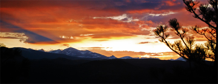
I personally like the cropping, it would make a nice poster. The composition is decent and I think the score is a bit low for this, but probably scored under average because of the negative black space underneath on the bottom of the frame. I love your inclusion of the foliage on the right but the mountains feel hidden to me, and I want to see more of them when looking at this.
The colors are awesome. I also love the lighting through the dramatic clouds. The photo isn't bad, just flawed and DPC voters are picky as you probably know. |






 Add photograph to your favorites
 Add photographer to your favorites


