| Author | Thread |
|
|
07/24/2010 10:02:48 AM |
|
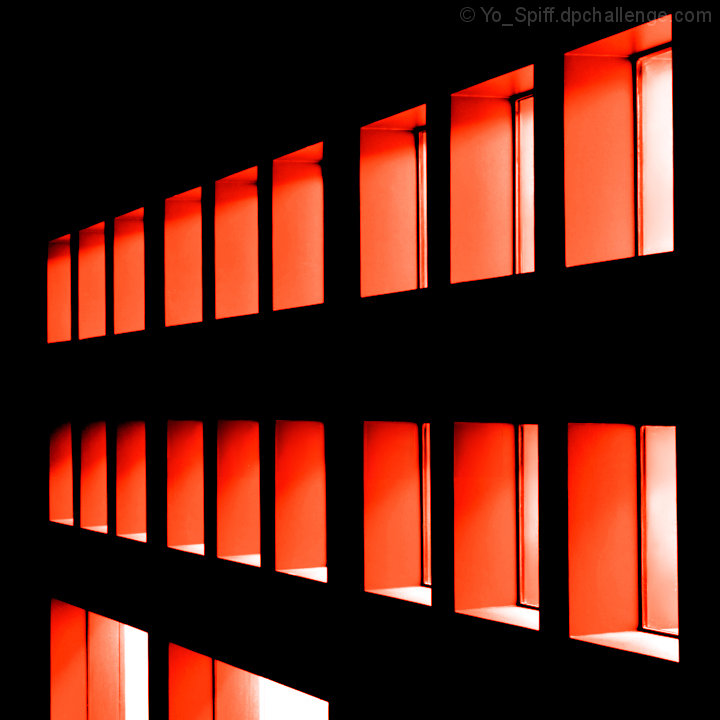
I love the lighting and the colors here Steve. Nice angle too. |
|
 Photographer found comment helpful. Photographer found comment helpful. |
Comments Made During the Challenge  |
|
|
06/21/2009 05:26:25 AM |
What fabulous use of the duotone brief. This image meets the challenge more fully than any of the others here I think since without the duotone it would be much diminished.
9 for its boldness and simplicity. |
|
| Photographer found comment helpful. |
|
|
06/19/2009 01:53:02 PM |
|
I love the different take on a dutone - I presume a ready made one, or maybe you added the red/orange? The composition is nicely unbalanced rather than giving in to all that symmetry and order in the building. A good graphic image and a topical title :) |
|
| Photographer found comment helpful. |
|
|
06/17/2009 10:27:15 PM |
|
Good fit for the challenge. I like the fact that it's different. |
|
| Photographer found comment helpful. |
|
|
06/17/2009 04:10:44 PM |
|
neat shot....really like your location alot... |
|
| Photographer found comment helpful. |
|
|
06/16/2009 01:32:56 PM |
|
| Photographer found comment helpful. |
|
|
06/16/2009 01:26:47 PM |
|
I like the light and the architecture, but I suspect this is not coming across as a true duotone - more like a color shot with just red, white and black. Most true duotones (at least the way I understand them, have the "hue" throughout. For instance if this was a red toned image, there wouldn't be any whites. Does that make sense? |
|
| Photographer found comment helpful. |
Theme:
Classic /
Light /
Dark
Home -
Challenges -
Community -
League -
Photos -
Cameras -
Lenses -
Learn -
Help -
Terms of Use -
Privacy -
Top ^
DPChallenge, and website content and design, Copyright © 2001-2026 Challenging Technologies, LLC.
All digital photo copyrights belong to the photographers and may not be used without permission.
Current Server Time: 10/09/2026 11:47:36 PM EDT.





 Add photograph to your favorites
 Add photographer to your favorites


