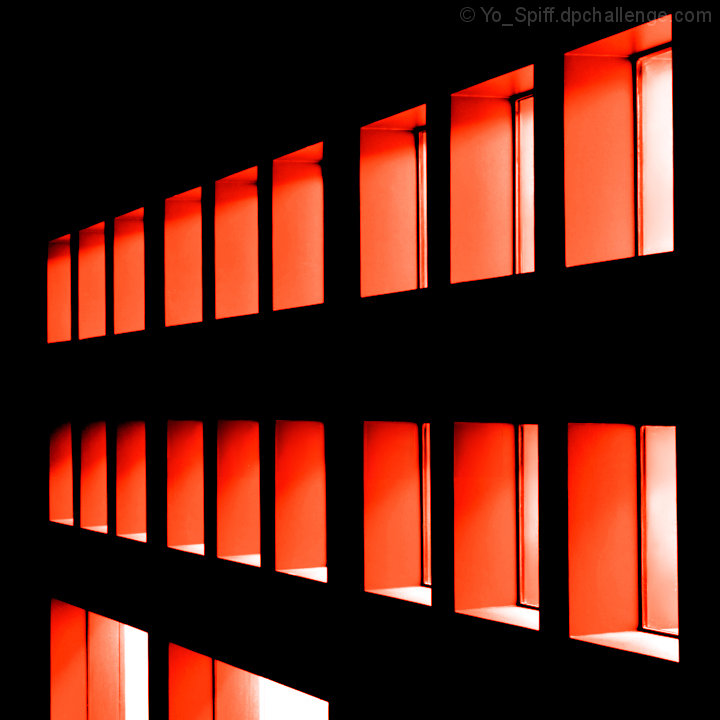
Fort Worth Museum of science & history. This wasn't my original idea for this challenge, but while I was here, I noticed the neat looking orange glow coming from these windows. It worked better in duotone than my original idea, which was ok, but looks much better in color. (Saving it for the freestudy) I picked up the orange color from the original image before converting it to greyscale. I actually liked the orange color of the original a little better, but was not able to bring that tonal range across into the duotone version. I still like the way it turned out. Ideally, I would like to remove those two windows at the bottom left, but I think that would be more selective editing than challenge rules would allow for.
Pre-challenge notes:
Expecting to get creamed on this one, as abstracts tend to not do well on the popular appeal scale. If I get some good comments from the folks who like abstract photography, that will make a success out of it.
Post-challenge notes:
Did better than I expected it to, but it started in the low 4's. This was interesting as it climbed at a regular pace the whole challenge, making for a 45 degree angle on the chart.
Here's an alternate edit that I prefer, but done without any editing rules or challenge theme to comply with.
Statistics
Place: 114 out of 253 Avg (all users): 5.5620 Avg (commenters): 7.3333 Avg (participants): 5.3733 Avg (non-participants): 5.8696 Views since voting: 1311 Views during voting: 207 Votes: 121 Comments: 7 Favorites: 0
What fabulous use of the duotone brief. This image meets the challenge more fully than any of the others here I think since without the duotone it would be much diminished.
I love the different take on a dutone - I presume a ready made one, or maybe you added the red/orange? The composition is nicely unbalanced rather than giving in to all that symmetry and order in the building. A good graphic image and a topical title :)
I like the light and the architecture, but I suspect this is not coming across as a true duotone - more like a color shot with just red, white and black. Most true duotones (at least the way I understand them, have the "hue" throughout. For instance if this was a red toned image, there wouldn't be any whites. Does that make sense?






 Add photograph to your favorites
 Add photographer to your favorites


 Photographer found comment helpful.


