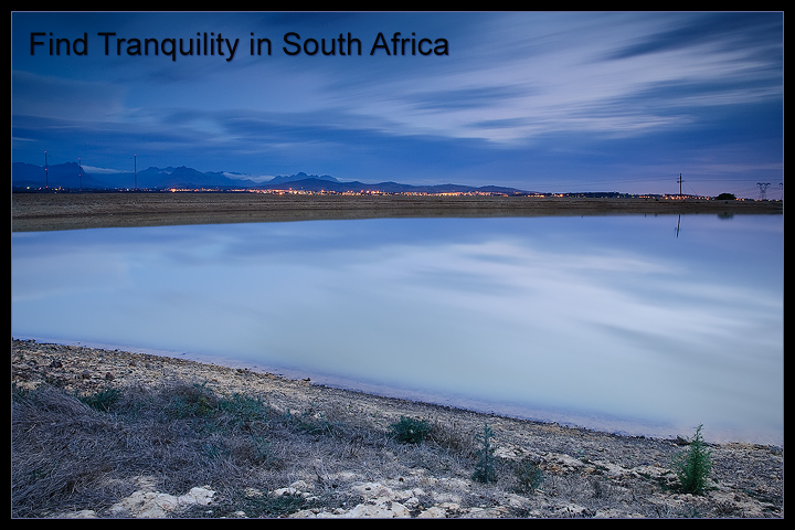
This is a tough image to critique. I like the colors and the exposure is well handled. Its sharp through out. So that all said, technically its a good image.
The problem I have is that my eye is looking for something rest on. The lines of the reservoir take your eye out of the frame. I'd be tempted to do a panoramic crop. (Start with where the nearest shoreline meets the edge of the frame and cut that all off)
Another great image - the sky matching the water is a very nice touch and as a marketing image, it would work well as a post card - it's sharp and evokes a sense of peace and quiet. Not fond of the way the font and color were treated - I might have worked with a slightly different font other than block black.






 Add photograph to your favorites
 Add photographer to your favorites

 Photographer found comment helpful.


