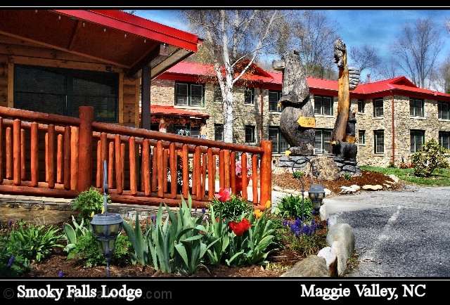
LOL at your comment!! This is one that when I saw it in voting I could VERY easily see sitting in a little display at the check-in desk as a postcard you could send to friends and family. Seriously! Not sure what you see is wrong with it, other than maybe a tad oversharpened. I think it's perfect for a postcard of the place!
Nice scene, definitely something this lodge might have for it's guests. One nitpick, however. I see a lot of jagginess, espcially around the bear and the red roofs. Not sure if it is oversharpening, or if it happened when scaling the shot down to 720 pixels.
A professional quality image which demonstrates the oeuvre of the tourist themed venue. The font and color are a good selection and the placement in a seperate bordered area at the bottom is a good way to not intrude into the image. Well done.
The composition doesn't work for me. The wood railing and flower bed dominate the image. If the POV was over to the right, maybe work the bear carvings into the image as a focal point with the lodge in the background maybe???
I'm not getting the essence of Smoky Falls Lodge with this composition; I'm not enticed to visit.





 Add photograph to your favorites
 Add photographer to your favorites

 Photographer found comment helpful.


