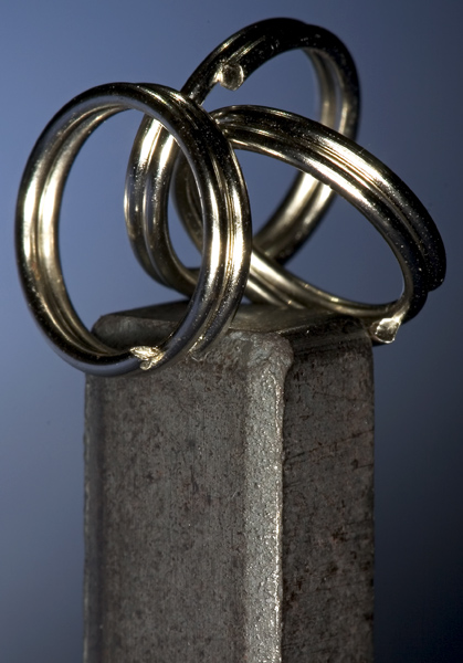
I enjoy the concept, and I think this shot makes a good statement. But at the same time, it lacks.... something. I really couldn't say what, but it just doesn't jump out at me. Maybe a different background color to offset the cold tone of the metal? Maybe a more simplistic metal (say, one ring instead of three?) to streamline the angles a bit more? I'm really not sure.
Um, I hate to be the one to break this to you, but steel is not the opposite of a magnet. It's an interesting composition, well exposed and focused, but without the challenge context, it seems nonsensical.
This is a good picture technically. I like the lighting and the DOF. I don't understand what is opposite about the elements in it, though. To me the picture needs something to add some life or soul to it. It feels very cold and clinical. Perhaps that was the intended effect.
I'm suprised that no one else used a magnet for this challenge. (not of the ones I've seen so far any way). Interesting composition and I like the monochromatic quality. 7.






 Add photograph to your favorites
 Add photographer to your favorites


 Photographer found comment helpful.


