| Author | Thread |
|
|
05/19/2004 01:13:34 PM |
|
Sher would create something much better, Kosta. :) |
|
|
|
05/19/2004 11:27:05 AM |
Originally posted by Azrifel:
I case anyone was wondering, I did use this particular map to say hi to Sher. ;) |
i was thinking is her photo ! |
|
|
|
05/19/2004 01:26:24 AM |
|
I case anyone was wondering, I did use this particular map to say hi to Sher. ;) |
|
Comments Made During the Challenge  |
|
|
05/18/2004 11:02:32 PM |
|
 Photographer found comment helpful. Photographer found comment helpful. |
|
|
05/15/2004 04:15:59 PM |
|
Would be better in color. 4 |
|
|
|
05/14/2004 09:49:49 PM |
|
Vidalia La,nice photo..10 ! |
|
| Photographer found comment helpful. |
|
|
05/14/2004 05:21:28 PM |
|
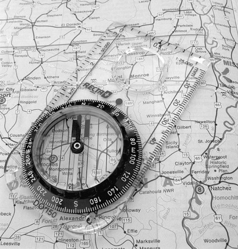
Excellent attention to detail. I like how you've oriented both the map and the compass toward magnetic north. I also like your greyscale - you've used the entire range available to you and provide good visual contrast. I'm not sure you captured the "opposite" theme, however. Am I missing the point? A map and compass by design "go together" - they are not opposites. Perhaps a different challenge. |
|
| Photographer found comment helpful. |
|
|
05/14/2004 11:42:33 AM |
|
This image doesn't appeal to me artistically, but it is well composed. |
|
| Photographer found comment helpful. |
|
|
05/13/2004 11:09:24 PM |
|
Very nice photo, great focus, an a great idea. |
|
| Photographer found comment helpful. |
|
|
05/13/2004 02:41:37 PM |
|
Very nice response to challenge with nice photograph. A 9. |
|
| Photographer found comment helpful. |
|
|
05/13/2004 12:36:32 PM |
|
Nice job, I like the black and white! Great photo overall... |
|
| Photographer found comment helpful. |
|
|
05/13/2004 11:51:00 AM |
|
Simple elegance. Love it! (8) |
|
| Photographer found comment helpful. |
|
|
05/12/2004 09:19:14 PM |
|
bump up your contrast, image is flat. |
|
| Photographer found comment helpful. |
|
|
05/12/2004 08:21:21 PM |
|
Almost did this myself....and I thought no one would like it. You present it well. Focus is good, B&W works well for it. Good job. |
|
| Photographer found comment helpful. |
|
|
05/12/2004 11:09:19 AM |
This image sort of follows my own submission in a North/South sort of fashion.
This is a very nice shot. Good detail. One thing I would attempt to do is to attempt to get rid of that small washed out spot on the top right of the compass, if looks like the plastic caught some flash(? ). |
|
| Photographer found comment helpful. |
|
|
05/12/2004 04:04:52 AM |
|
| Photographer found comment helpful. |
|
|
05/12/2004 12:31:21 AM |
|
i like it .... tho imho it needs a bit more contrast |
|
| Photographer found comment helpful. |
Theme:
Classic /
Light /
Dark
Home -
Challenges -
Community -
League -
Photos -
Cameras -
Lenses -
Learn -
Help -
Terms of Use -
Privacy -
Top ^
DPChallenge, and website content and design, Copyright © 2001-2026 Challenging Technologies, LLC.
All digital photo copyrights belong to the photographers and may not be used without permission.
Current Server Time: 10/09/2026 07:03:27 PM EDT.






 Add photograph to your favorites
 Add photographer to your favorites


