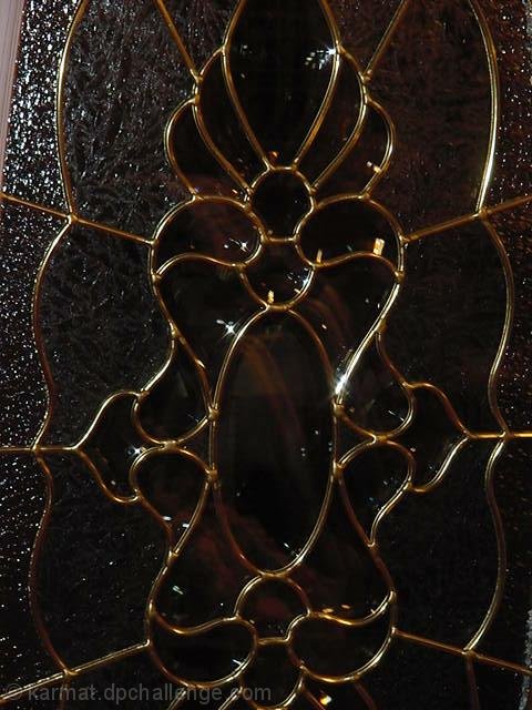
Seems a bit soft/ not sharp enough to really jump. Subject doesn't do much for me. You seem to have cropped it/ been a bit too close at the top, cutting off one of the curves.
I think the lighting could be better -- looks like there's some blurring here, though it might just be the leading seen through the glass. Could be less "blurred" if it were backlit?
good capture of the theme, it looks a little dark however, plus it needs to be just a bit to the right, you got just a bit of the door in the upper left corner.
These are nice curves but i think a little more contrast somehow would have made a nicer shot. I can't really tell if this is a window or not, but maybe if it was backlit, the contrast would be there :)
I like this but think the left side of the door should have been cropped out and the flash spots take from it:( Maybe a different angle would have helped. It is a awesome idea and beautiful:)






 Add photograph to your favorites
 Add photographer to your favorites


 Photographer found comment helpful.


