| Author | Thread |
|
|
09/15/2007 11:35:27 AM |
Critique Club feedback -
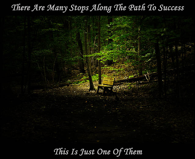
Very odd choice of image and message (or message and image). A step to success is a bench?
Photo itself is very nice, particularly how it fades to black towards the bottom. This probably would have popped more if all the text were at the bottom of the shot in the dark area. The top line looks a bit 'crammed in' and works against a sense of balance for the poster as a whole. |
|
 Photographer found comment helpful. Photographer found comment helpful. |
Comments Made During the Challenge  |
|
|
09/09/2007 10:52:58 PM |
|
| Photographer found comment helpful. |
|
|
09/09/2007 09:38:31 AM |
|
| Photographer found comment helpful. |
|
|
09/09/2007 03:17:10 AM |
|
Great picture, nice poster. |
|
| Photographer found comment helpful. |
|
|
09/06/2007 03:12:21 PM |
|
To tell you the truth, I just didn't get it. layout bother me a little... nice colors though and looks like a nice place to sit. |
|
| Photographer found comment helpful. |
|
|
09/05/2007 06:39:08 PM |
|
very nice idea, I dont think you needed to darken around the bench as much as you did. |
|
| Photographer found comment helpful. |
|
|
09/04/2007 06:36:06 PM |
|
| Photographer found comment helpful. |
|
|
09/03/2007 10:13:44 AM |
|
| Photographer found comment helpful. |
|
|
09/03/2007 07:29:47 AM |
|
| Photographer found comment helpful. |
Theme:
Classic /
Light /
Dark
Home -
Challenges -
Community -
League -
Photos -
Cameras -
Lenses -
Learn -
Help -
Terms of Use -
Privacy -
Top ^
DPChallenge, and website content and design, Copyright © 2001-2026 Challenging Technologies, LLC.
All digital photo copyrights belong to the photographers and may not be used without permission.
Current Server Time: 10/14/2026 05:15:31 AM EDT.






 Add photograph to your favorites
 Add photographer to your favorites


