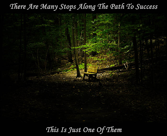
While preparing for shooting a model I traveled to Hedden park in Randolph, NJ. Along one of the hiking trails was this bench. I found it amazing that in the middle of a hiking trail with nothing around but trees, rocks, and brook, that there was this bench just sitting there. So of course having my camera in hand I took photos. This photo was after I took the initial photos....went to find and take notes on the spot I want to shoot my model and was on my way back to my car to go home. The lighting on the original photo gave me the idea for what i wanted to see in the final edit. The path to getting to that final edit is still kinda hazy because I changed it multiple times.
DPP:
Change White Balance to Cloudy
Convert to 8-Bit Tiff
Photoshop:
Circle selection around bench
Added rectangular selection from center of circle selection to top of photo
Inverse selection
Adjustment layer-curves-darken
Okay here is where it gets fuzzy because of the many many edits I did.
I think I added a lighting effect using Omni and confining it to the bench.
I also think I did a new adjustment layer - selective color- adding some yellow and black to the green, some magenta to the yellow and some yellow and magenta to the red.
I think I flattened the image, duplicate layer, changed blending mode to soft light.
Now back to what i know I did after that part...
Unsharpened masked
duplicate image
Desat red, blue, cyan, magenta on duplicate
half sat yellow and green
copied duplicate back into original
(more confusion)
Changed blending mode to either lighten or darken...I think darken.
(no more confusion)
resized image
sharpened
saved as JPEG
Statistics
Place: 84 out of 165 Avg (all users): 5.7071 Avg (commenters): 5.8571 Avg (participants): 5.4167 Avg (non-participants): 5.8730 Views since voting: 1561 Views during voting: 330 Votes: 198 Comments: 9 Favorites: 1 (view)
Very odd choice of image and message (or message and image). A step to success is a bench?
Photo itself is very nice, particularly how it fades to black towards the bottom. This probably would have popped more if all the text were at the bottom of the shot in the dark area. The top line looks a bit 'crammed in' and works against a sense of balance for the poster as a whole.





 Add photograph to your favorites
 Add photographer to your favorites

 Photographer found comment helpful.


