Critique Club:
I saw you ask about this in the forums, so I don't really have much to add.
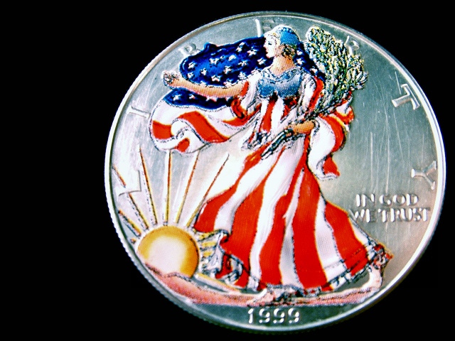
Composition wise, you've tried to not center it, which normally is a good thing, but I don't really see any purpose in the black space to the left of the coin. Maybe a bit more space, or less, would improve the image.
I think just a close up of a coin, whilst fitting the macro theme of the challenge, just isn't very imaginative. This is what explains your low score in my opinion. I saw in the forums you were experimenting with different angles and things, which is what I would have suggested. |






 Add photograph to your favorites
 Add photographer to your favorites

 Photographer found comment helpful.


