I saw you ask about this in the forums, so I don't really have much to add.
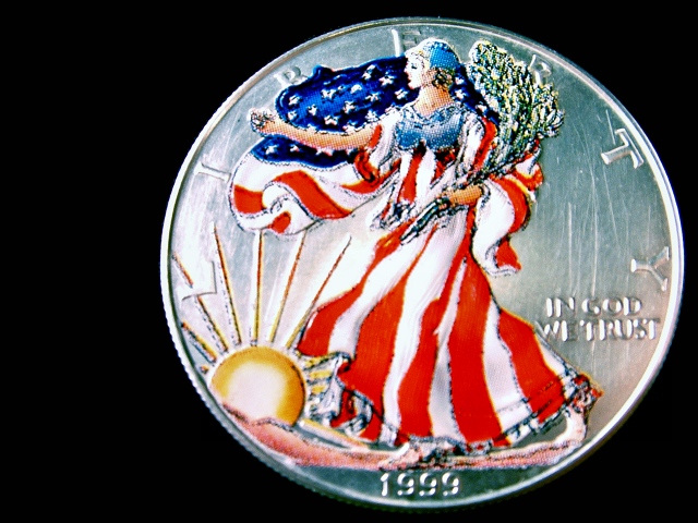
Composition wise, you've tried to not center it, which normally is a good thing, but I don't really see any purpose in the black space to the left of the coin. Maybe a bit more space, or less, would improve the image.
I think just a close up of a coin, whilst fitting the macro theme of the challenge, just isn't very imaginative. This is what explains your low score in my opinion. I saw in the forums you were experimenting with different angles and things, which is what I would have suggested.
Good focus and detail at the top, then the DOF fades and can't see the rest. On this I would want to see all the detail throughout. Why did you choose this crop? Nice lighting though
Colorful coin (a bit out of focus?).... It is hard to achieve any 'real' composition with a shot like this (in a 2D plane). Possible critique: The shot could have been made more interesting (for example) by standing the coin on edge and illuminating it so as to cast a shadow beyond, adding another element to the shot.







 Add photograph to your favorites
 Add photographer to your favorites

 Photographer found comment helpful.


