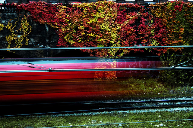
Taken in Raw and adjusted a little bit in Nikon Capture Editor; sharpening, tone comp, colour mode and Saturation.
In Photoshop, levels, curves, brightness and contrast. Toned the green down with selective colour layer, USM and save for web.
I tried several different train stations as there were always so many things in the way. And then it was not all that easy to hit the button at exactly the right time, but in the end I did. Or at least I think so :)
I was a bit nervous as it was getting late. I took this almost exactly at sunset that afternoon.
Statistics
Place: 112 out of 196 Avg (all users): 5.4566 Avg (commenters): 6.6667 Avg (participants): 5.4314 Avg (non-participants): 5.4786 Views since voting: 752 Views during voting: 359 Votes: 219 Comments: 15 Favorites: 0
Greetings from the Critique Club: I have been assigned your photo to critique and here are my thoughts:
Personal Reaction: I liked the photo right away. But it didn’t hold my attention for very long. Although I didn’t vote this challenge, I probably would have given it a 5, possibly a 6. But I am a critical voter.
Composition: Good composition. I like that I can see the top of the hedge. I like the placement of the red streak. I like that the red streak is more heavily weighted to the left adding a real sense of motion. And I like that I can see the graffiti through the blur. So, great job on the composition.
Technicals: Good focus & DoF. Very good color. Possibly a bit over sharpened. Your timing was flawless!
Conclusions: So why the middle-of-the-pack score? I think what grabbed my attention first was the bright vibrant color. But the subject didn’t live up to the expectation the color set. It wasn’t that strong or that intrinsically interesting of a subject. The other issue some voters may have had was that it was a clichéd image. As a blurred motion shot, you did a splendid job. But many voters have done it themselves and once they got it right, they lost interest in the technique.
As always, this is my personal opinion. Feel free to PM me if you’d like further dialog.
I got a $50 ticket trying to get a similar shot! Good color in the background and I like the grafitti from the train. It looks like there's a blue tint in the rocks.
There's a couple of pics over at //www.sightphoto.com/sightphoto/timeandplace/timeandplace05.html that is very similar. A wonderful photo site, I love to browse through it.





 Add photograph to your favorites
 Add photographer to your favorites

 Photographer found comment helpful.


