Multiple adjustment layers including Sepia, B/W, Contrast & Brightness, Saturation, USM, Resized, Saved for Web
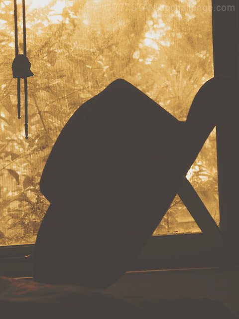
I agree with all the comments about this photo being flat & not black enough to be called a true silhouette. This was my first attempt at really playing with Levels. Boy, did I blow it! My bad! Back to the drawing board...
Statistics
Place: 338 out of 352 Avg (all users): 3.8160 Avg (commenters): 3.7647 Avg (participants): 3.7172 Avg (non-participants): 3.8808 Views since voting: 718 Views during voting: 333 Votes: 250 Comments: 19 Favorites: 0
You've already heard from others about the need for more contrast to take the silhouette darker. Focus is good. I like the color of the piece, and the texture that helps isolate the background from the hat.
The bolo tie hanging from off frame, and the window frame/prop for the hat, distract the eye somewhat. Perhaps a different angle, and maybe using just the Stetson for a subject might have helped. (Most people see cowboy hat and think Texas anyway.)
Perosnally, I'd like to see a similar picture in a different challenge where it doesn't have to be a silhouette. The warmth of the colors, and the earth tones on the ledge could work to make a really wonderful picture. It holds the interest quite well as it is.
A couple of issues here. One your contrast seems a bit off as there is a "haze" over the whole image. Your blacks aren'te truly black. The other is that the angle of the cowboy hat combined with the frame of the window hides the hat's strong and distinct lines.
little bit over-exposed. I would suggest darkening the darks and seeing how that would look. If the black were blacker, I think I'd give a higher score
If you were to take this image into an editor and sample the color of the hat, you would find it is somewhere around R:69, G: 66, B: 61. On the other hand, if you take a look at the strongest contenders in this challenge, they will probably have subjects that are much closer to R:0, G:0, B:0 (in other words, black). The hat in this subject is too gray....
This one needs improvement - the levels are wrong. Compositionally there's too many competing elements here, and the object obscuring the lower side of the hat brim really detracts.





 Add photograph to your favorites
 Add photographer to your favorites

 Photographer found comment helpful.


