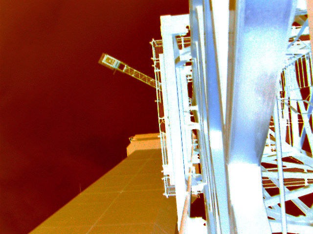
Well my friend you are learning the hard way which is good. DPC does not like over processed images like this. I agree that the b&w would have been a better way to go. Also I would have moved away from the building a bit so I could more easily tell what it was an image of. Keep on Keepin' on my brotha'.
I definately like the B/W version for this shot. Need to get it more in focus and play with the contrast a bit. Definately more in focus. Happy shooting.
I was going to shoot something similar but you took this to a psychedelic extreme! The colors are interesting but is not the type of image (digital art/abstract) to do well at DPC.
like the the all the way up part, but not the reverse. I assume the image wasn't as interesting as you had hoped and thats why you reversed it. I still would have liked to see the original though.






 Add photograph to your favorites
 Add photographer to your favorites


 Photographer found comment helpful.


