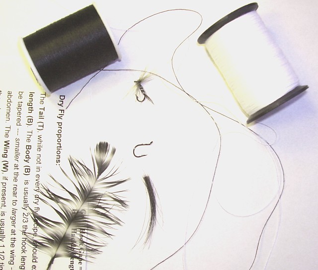
Nice title. This is a cool idea, but the technicals seem to be lacking a bit. The white spool is quite blown out, but it could really still use some contrast. Seems a bit overexposed.
I think this could hvae been better had it been rotated 90 degrees CCW. It forces you to try and turn your head to the side. Also more contrast would have worked.
This has good potential. But the text limits the effect greatly. Fair enough, play with the viewer and tilt the text - but overtilting it simply takes away the focus on the items of interest and creates a disharmonic effect. Close up to remove so much diluting background would have been better too. 6.







 Add photograph to your favorites
 Add photographer to your favorites


 Photographer found comment helpful.


