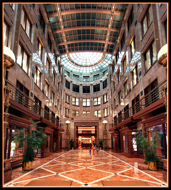
Very good use of perspective in this very good interior photo. I was originally going to comment on the photo being tilted, but I now see that's just some vertical perspective and the horizontal line are dead on. Sorry, not sure why I felt the need to ramble on about that. One nitpick, which is strictly opinion, is the partial inclusion of the lamps at the edges. I wonder if a greater or no inclusion would be an improvement.







 Add photograph to your favorites
 Add photographer to your favorites


 Photographer found comment helpful.


