My very first challenge. Go ahead, tear it apart! :) I'm here to learn! It's not what I hoped but better than I expected, if you know what I mean.
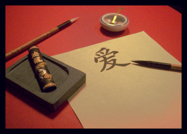
This is a Chinese letter-writing set I received as a gift, and the Chinese symbol for Love is on the handmade paper.
My changes:
Crop
Border
Curves
Despeckle
There was a bit of my black work area showing at the edges, which I did my best to crop out. Didnt get it all, but when I added the black border (as I planned anyway), it made it a lot less noticeable (since we cant use Cloning.)
I did an on-camera white balance for Tungsten and Daylight but I didnt like those nearly as well as the Fluorescent balance with the golden tinge, since that made it look antique (I was using Tungsten bulbs). I did use Curves to take out just a bit of the yellowness. I didnt get the nice deep red I wanted in the background, though. :o/ It looks sort of orangish.
Took this on 400 speed film so it's a bit grainy, even after a despeckle. I'm not too happy with the harsh shadows, but that's something else I'm working on as well.
I'm new at curves, and also relatively new at using my camera's manual settings, which I almost exclusively do now because Auto just dont cut it anymore. :)
Statistics
Place: 20 out of 122 Avg (all users): 5.9661 Avg (commenters): 6.6875 Avg (participants): 5.7500 Avg (non-participants): 6.0167 Views since voting: 7068 Views during voting: 391 Votes: 295 Comments: 17 Favorites: 2 (view)
Nice composition. I only wish it was a bit sharper. Not saying that's always required however, I don't get the sense a softer image was the intent here. With that said, this is different and has a good crop. 6.
Elegant shot. The subdued light and colours work well, and the elements are all nicely composed. Its a shame that there's a red tinge creeping in to the bottom right of the paper.
I really love this, the red background and black border set it off nicely and you've got all the perfect touches at just the right angles and placement in the frame. BUT! It's not quite in focus and it seems really grainy. Better lighting maybe?
Faux. A good idea and well arranged with the right character at least. But where is the ink liquid in the ink stone? The character is obviously printed, not a result of personal hand inked caligraphy. Nice one but you could have put the extra ten cents in to make it great.





 Add photograph to your favorites
 Add photographer to your favorites

 Photographer found comment helpful.


