| Author | Thread |
|
|
11/15/2006 08:15:03 PM |
|
I love this image! looks like it could be a still life shot from a wedding! Good Job! |
|
 Photographer found comment helpful. Photographer found comment helpful. |
Comments Made During the Challenge  |
|
|
07/11/2006 07:02:25 AM |
|
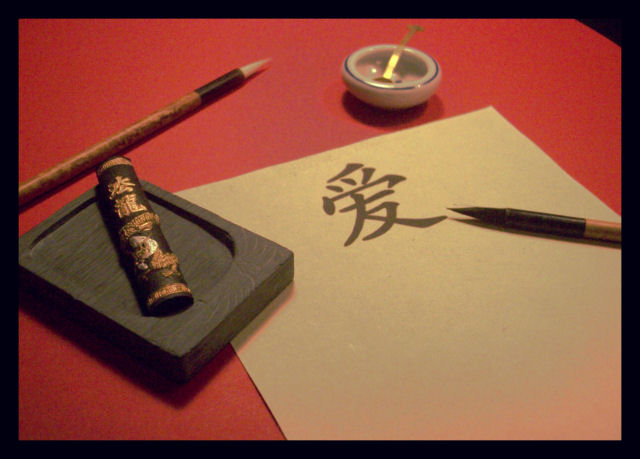
Is this literal? Is that the "letter" for "love"' in chinese? Very nicely depicted and photographed. |
|
| Photographer found comment helpful. |
|
|
07/08/2006 10:53:29 PM |
|
Seems to be a little grainy and the colors are flat |
|
| Photographer found comment helpful. |
|
|
07/08/2006 02:12:27 PM |
|
Nice composition. I only wish it was a bit sharper. Not saying that's always required however, I don't get the sense a softer image was the intent here. With that said, this is different and has a good crop. 6. |
|
| Photographer found comment helpful. |
|
|
07/07/2006 08:14:32 PM |
|
Like this chinese stuff. Calm an well composed image. Unfortunately a bit blurry. |
|
| Photographer found comment helpful. |
|
|
07/07/2006 12:09:22 PM |
|
Tonal quality of the image is great IMO. i like the effect and the lines of the 'pens' in the image. |
|
| Photographer found comment helpful. |
|
|
07/07/2006 09:14:57 AM |
|
Love the angles and colors in this image. The soft focus is very pleasing and works well. I'm scoring this one pretty high. |
|
| Photographer found comment helpful. |
|
|
07/06/2006 08:09:39 PM |
|
Focus feels a little soft. Nice color tones. |
|
| Photographer found comment helpful. |
|
|
07/06/2006 09:25:25 AM |
|
| Photographer found comment helpful. |
|
|
07/06/2006 06:06:54 AM |
|
Nice composition and use of the classic colour. |
|
| Photographer found comment helpful. |
|
|
07/05/2006 08:18:53 PM |
|
Nice composition, focus is a little soft, tho. |
|
| Photographer found comment helpful. |
|
|
07/05/2006 08:02:26 PM |
|
Elegant shot. The subdued light and colours work well, and the elements are all nicely composed. Its a shame that there's a red tinge creeping in to the bottom right of the paper. |
|
| Photographer found comment helpful. |
|
|
07/05/2006 06:45:20 PM |
|
| Photographer found comment helpful. |
|
|
07/05/2006 03:55:47 PM |
|
I really love this, the red background and black border set it off nicely and you've got all the perfect touches at just the right angles and placement in the frame. BUT! It's not quite in focus and it seems really grainy. Better lighting maybe? |
|
| Photographer found comment helpful. |
|
|
07/05/2006 03:25:10 PM |
|
nice, but that Chinese sign looks a little too perfect to be handwritten...should have used an actual sign that was written, not printed or stamped... |
|
| Photographer found comment helpful. |
|
|
07/05/2006 01:12:42 PM |
|
Faux. A good idea and well arranged with the right character at least. But where is the ink liquid in the ink stone? The character is obviously printed, not a result of personal hand inked caligraphy. Nice one but you could have put the extra ten cents in to make it great. |
|
| Photographer found comment helpful. |
|
|
07/05/2006 12:53:33 AM |
|
| Photographer found comment helpful. |
Theme:
Classic /
Light /
Dark
Home -
Challenges -
Community -
League -
Photos -
Cameras -
Lenses -
Learn -
Help -
Terms of Use -
Privacy -
Top ^
DPChallenge, and website content and design, Copyright © 2001-2026 Challenging Technologies, LLC.
All digital photo copyrights belong to the photographers and may not be used without permission.
Current Server Time: 10/10/2026 03:52:44 PM EDT.







 Add photograph to your favorites
 Add photographer to your favorites


