Author Thread Comments Made During the Challenge
Post actions
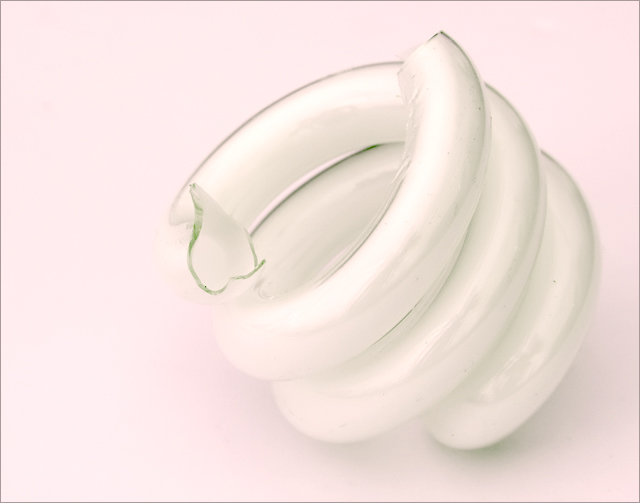
One of my top five. I like the simplicity and the "twists".
Post actions
I think putting the bulb/glass on a different colored background would have been much better because the white on white is too much. It needs some contrast.
Post actions
I like the simplicity of this shot, the soft focus and the high key look.
Post actions
Meets Challenge: 1/1
Post actions
This meets the challenge perfectly.
Post actions
Post actions
I think a darker background would have given the subject a little more pop.
Post actions
I like the feel of this. Very cool.
Post actions
The jagged edge is quite abrupt in the otherwise soft, delicate setting. Nice take on the challenge.
Post actions
Post actions
I would have enjoyed it more with a more contrasting background.
Post actions
Interesting high key effect but may be misinterpreted as overexposed.
Post actions
lovely soft color. i would still prefer if part of the image were focused sharply though. there are a couple distracting black spots but obviously you cant do much about that in basic editing. great composition.
Post actions
Post actions
Hah hah, very interesting idea that goes with the challenge title :)
Post actions
this would have been nice with a lot more contrast
Post actions
Cute title, should have taken two of those and put "II" in the title too, that would have been even funnier :)
Post actions
I like the idea, and the shot....the pink colouring doesn't work for me though. I would have liked it better as a high contrast black and white shot.
Post actions
nice and simple, well done
Post actions
Clever title given the challenge. I like the white on white and the composition. I do think it could have been a little bit sharper.
Post actions
image could use more contrast to make the glass stand out more.
Post actions
Post actions
Plain and simple, Very good picture.
Post actions
Should have been "Twisted Glass"
Post actions
Clever take on "with a twist"! Love the high key.





 Add photograph to your favorites
 Add photographer to your favorites


 Photographer found comment helpful.


