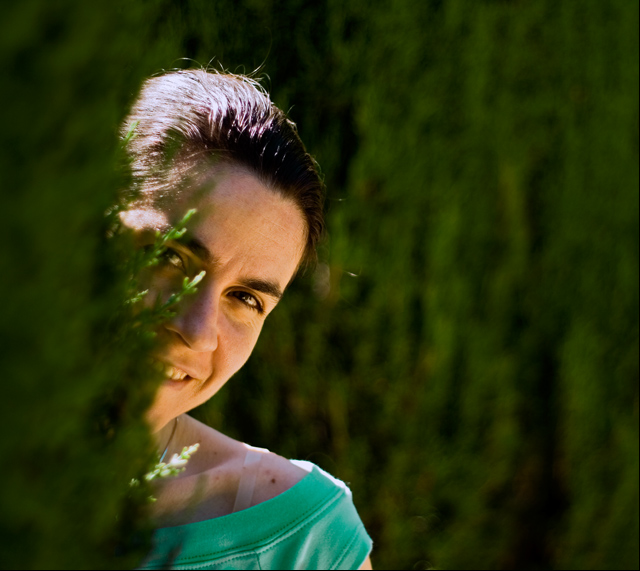
Ok, the two issues I have with this is the out of focus areas and those rouge branches over the face. In the out of focus areas I feel the blur doesn't look good. When I look at that it looks like there are brush strokes probably just the way the blur was rendered but I would blur it more in post just so it was smoother.
The other thing is the two branches over the face. I just wish they weren't there. Other than that I like the image. The composition works great.
Greetings from your own critique club. Sorry, I was off the hook for a while.
First Impression Nice shot, may not meeting the challenge. Particularly there are so many DNMC police around in DPC. LOL
Composition: Did not like tree in the forgraound. OOF foreground tree is still fine, but don't like the focused branched on the face.
Subject: There is lots green in picture, but the sunlight on the face with high contrast leads eye there.
Technical (Colour and light): Good DOF, colors. I think there is too much light on face compare to foreground and BG.
Improvement: Less light on face, more light on the green trees.
Summary: Not one of your best shot, I firmly believe you can do better than this.
Greetings from CTP2 Gunnsi
First impression I want to see her face!, The branches are in front of her eyes and that is very distracting. Either hide away the eye or show it all. In this way I get irritated looking at it and try to blink to get rid of the distraction. Good colours, green :-), good focus and lighting.
What can you do better Take away the little branches from her eye. :-)
Good luck next time.
This is an interesting idea. I like the 'peeking out from the greens' idea. It would have been nicer to see a bit more of her face, though. The branches in front of her right eye are distracting. Also, the bra strap doesn't look very good. Fix those two things, and this would be a really nice portrait.





 Add photograph to your favorites
 Add photographer to your favorites

 Photographer found comment helpful.


