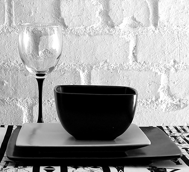
Was looking for more subtle lighting than this ... but couldn't get it right. That's what happens when you don't take advantage of cloudy days and windows and waste time and do the shooting at night ... in the garage ... because that's the only wall with a really interesting texture.
* Conversion From RAW
* Neat Image - didn't reset the camera from ISO 1600
* Sharpen
* Levels - extreme
* Hue / Sat to almost completely desat
Guesstimated Score: 5.2 to 5.5
Statistics
Place: 35 out of 338 Avg (all users): 6.0400 Avg (commenters): 7.5625 Avg (participants): 5.9318 Avg (non-participants): 6.1095 Views since voting: 940 Views during voting: 301 Votes: 225 Comments: 19 Favorites: 1 (view)
Greetings from the Critique Club. My critiques are generally geared towards trying to help you improve your score within DPC, and not on any true "artistic" merit of the photograph itself, unless it relates to DPC voters and scoring. Please keep that in mind as you read this.
Initial Thoughts Nice arrangement, and B&W works for this shot, although I'm unsure about the wall.
Composition/Content The assymetrical composition is something I'm not entirely sure of, personally. I'd like to see what happens to this shot with the plates and bowl lined up more centrally. From what I can picture, it'd ground the photo a little more. I also think it might have benefitted from a little more of a portrait orientation instead of square, but that's just me. As it stands, to my mind, it just doesn't feel right.
Background As you stated, the lighting is harsh on the wall, and tends to take away from your subjects and arrangement. A softer mood would definitely have helped.
Camera Work/Technical You did a pretty good job exposing for the light you did apparently have, with only the wall in the upper right really being the only bit slightly out of exposure. I'm glad you put in your comments that it was accidentally shot at 1600, or that would have really confused me. hehe. Nice work with the neat image though, I never would have been able to tell.
Digital Processing As I said, good work on the neat image. Everything else looks really good as well, and the B&W conversion is quite nice, disregarding the over-exposure on the wall.
Fits the Challenge A good fit for this challenge, as it contains all the elements necessary.
My Opinion of the Photo As your title says, it really doesn't contain much of what DPC needs to score hugely high, but as you seem to have known this going in, I won't dwell on it. Some tweaking with your set-up though, and it could have had quite a bit more impact. Still, a 6 is never a bad score, so nicely done.
Maybe boring, but it is definitely one of the better stills. Like the black and white and the gorgeous translucency of the glass. Nice job. So far this is the only 10 I have given, and I have already voted on 200 images.
The stark contrast is good. Ther busy pattern of the surface is a bit distracting. I think I'd like to have the glass not "chopped off" by the square plates. At least you "got it" and this is a true still life.
Should be titled "Simple Elegance" :) The many levels of contrast, in light, textures, shapes and materials, catch the eye immediately and hold the interest as we explore the details. My favourite so far.





 Add photograph to your favorites
 Add photographer to your favorites

 Photographer found comment helpful.


