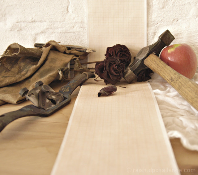
There was some question on the forums about what still life is. I thought the object of the exercise was to reproduce as convincingly as possible a variety of textures (textile, cheese, ceramics, metal etc.). On looking further into the matter I found that one of the reasons for artists to choose the genre is the freedom to arrange the subject matter for pictorial composition. I haven't exactly pushed the envelope here, but those were the criteria I worked to. I used indirect, available light and took down the colour saturation for the sake of texture.
With a decent tripod I might have increased the depth of field, although I say that now - the limited dof was intentional at the time.
Statistics
Place: 171 out of 338 Avg (all users): 5.1373 Avg (commenters): 6.5000 Avg (participants): 4.7835 Avg (non-participants): 5.3897 Views since voting: 842 Views during voting: 303 Votes: 233 Comments: 10 Favorites: 0
The more I look at it, the better I like it. I am not quite sure what those objects are doing together like that...and that's one of the things I think I like about it.
I like the enigmatic grouping of objects, very poetic. The paper reminds me of an EKG, or whatever its called. The rose and the apple also evoke the notion of the "heart." The mechanical object looks like it could be part of some 19th century EKG (as if such a thing existed!), which is carried in a burlap bag (suggesting war to me). The hammer suggests things are unfinished. the EKG needs to be put together, our mind needs to "put together" these items, i.e. to make sense of them. The pencil represents a different kind of creation. Very thought provoking, with figurative and literal representations of the heart. 9.
I like the choice of objects. I think something needs to be closer to the foreground though. (or maybe crop off the bottom) The composition makes me feel like the objects are shy.
Interesting.... but I just don't like the apple. I like the way the other disparate elements are drawn together by their tones, but the apple doesn't tie in in any way that I see. If it's meant as a contrast, to stand out, it's not vivid/different enough to quite succeed. I really like the lighting and composition, the leading lines, just not that one little thing.





 Add photograph to your favorites
 Add photographer to your favorites

 Photographer found comment helpful.


