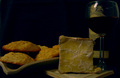
I really liked this one - its very cleanly composed, and a great idea, but theres something about the exposure on the coke piles that doesnt sit with me - possibly the odd bit of blown highlight, or oversharpening, or something, I'm not sure :S
Obviously if you could have got the black/white division, and the respective beackgrounds cleaner, that would have been great, but I know that can be v hard. It also seems as though the left woody is slightly overexposed.
I think this is a good idea that suffered on the execution side of things. I believe a solid dark background for both sides would have been preferable to the split screen. The wrinkles on the white side are distracting. Focus seems off a bit, too.
I didn't vote for this photo, but I probably would have given it a 4 because of these problems.
I didn't vote on this, but I would have voted really low, the focus is off, background is bad ( try using a single color and if using cloth, iron it first)
the split down the center isn't working for me, and since you don't enter any information I can't comment on postprocessing.
Trading Post -
I gave a 4 on this one. The focus seems really bad on this shot. Did you use a tripod? The background needs som ework as well. I think if you had gone with one color and laid the fabric out so that it didnt have a right angle but a nice soft curve up it would have helped alot. An interesting concept I guess, but not enough to carry it higher. This shot just didnt capture my attention like it could have.
Trading Post comment
LOL! This is hilarious! I didn't vote in this challenge so I didn't see this until just now. A great idea, though I suspect a lot of people didn't see it as a "still life". What probably let you down in the scoring was a combination of the white background/backdrop, and the clarity of the cans. Though it would require a pretty good sized piece of posterboard or paper, that might have worked better in this case than fabric. Very, very creative!
--Trading Post--
This was one of the most creative shots in the entire challenge. It drew a chuckle out of me. It does appear that the focus is off just a hair. It looks like your main lighting was from the left side, thus casting a pretty harsh shadow from the left cans onto the white background. By eliminating that little detail, this one would have done a great deal better. Great idea.
Trading post...
I thought the concept of this was great. I gave this a 5 in voting for creativity. The background is a little distracting since you can see the division so well, plus the wrinkles on the white side are so obvious. It also seems to be just a tad OOF.
I missed the point on the first round. I didn't realize that they were different kinds of coke, one without caffeint and the other with caffeine. Are the gold cans also less calories? Anyway, I don't ordinarily like the shots made with the mannequins, but this one really works. It is creative and very cute. Like it alot.
I guess it meets the definition of a still life but I don't resonate with the subject. It brings me no joy or catharsis. Guess I'm a lost cause for this kind of photo.






 Add photograph to your favorites
 Add photographer to your favorites

 Photographer found comment helpful.


