Interesting photo. I do not see the association to the lenscap theme however. (Sorry, but I cannot vote higher therefore.)
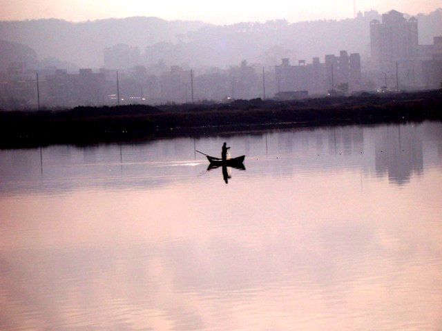
My opinion on the image by itself: I would consider straightening the image, and cropping some off the bottom. Just my opinion. I like the reflections in the water and the lone fisherman. Good idea.
It looks like there was difficult lighting. The darks are good but the rest seems washed out. While I often like the use of big "negative space", I think it works against this particular shot. Zooming or cropping would give me a better impression of what the man is doing.
Uh-oh. . .I see another one here that looks like it should have been in another challenge ??? I love the photo (except for the tilt), It's really neat looking with the mist and the pinks. ..but can you pm me and tell me about the lenscap? Nice photo!
What the hell? Where are the lens caps? Is the guy tossing them from the boat? If so, I can't do anything but "take your word for it." If he is doing so, you should have shown so better; if not, then this image just doesn't belong in this challenge. It's a nice shot (I rather like the tilt of the horizon [sincerely]), but I can't give it a high score because of the distinct possiblity that it disregards the "lens-cap" theme.
Not trying to be mean, just explaining the low vote: DNMC - no lens cap.
I think that perhaps the challenge was misinterpreted as 'Landscape'(?). Had the challenge been landscape, this would have been my comment: Your horizon is badly tilted - everything is running downhill to the left. Centering the boat and fisherman is not very interesting compositionally. The reflection is nice, and the colors are soothing, but unfortunately it is not enough to overcome the tilt and the composition.
The photo doesn't seem to contain a lenscap. Additionally, the angle at which the photo is taken makes the camera look like it was tilted. I would have rotated the picture to make the riverbank horizontal to improve this shot.
I'm sure by now you realise there's no lenscap, so I'll comment on the photo you DID submit. I do like the colour and haze, but the tilted horizon is a major distraction, and easily corrected. Also, centering your subject gives a very static feel. Try cropping to the rule of thirds and see the difference. If you're not sure about any of this, a search of the forums will bring up a wealth of information :)
Lol! Sorry but did you forget to read the challenge description or are you aiming for the brown ribbon. I´ll help you along with that if that was your goal :) 1 from me.
A lenscap is supposed to be the main subject in this challenge. I can only guess that the man in the boat dropped his lenscap in the lake and is trying to retrieve it using a net.






 Add photograph to your favorites
 Add photographer to your favorites


