Again I plead, always try to include some info about the shot in the Photographer's Comments section. It really helps out when we know what the photographer was thinking and what equipment/lighting/etc. were used, especially when you request a critique.
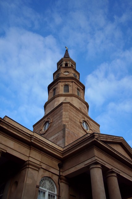
Camera Work/Technical: Nice exposure and great depth of field use, ensuring that everything in the frame was focused. Your coloring is very nice and the WB seems to be right on target.
Lighting: I think that you picked the right time of day for this shot, but the lighting looks just a bit flat. While the building contrasts nicely with the sky, the building itself looks like it could use some contrast of its own. A slight s-curve adjustment in curves should remedy this easily.
Composition/Content: I like the use of a centered composition here. It breaks the "rules" of photography and still yields a very nice photograph. I'd like to see a bit more of the building's bottom, perhaps without chopping off the window that's in the frame. The steeple serves nicely to carry the viewer up and into the frame.
My Opinion: This one fits into the challenge nicely, but is lacking that unique feature that distinguishes it from the rest of the entries. Perhaps a slightly different vantage point or m a touch more contrast, but something is just slightly lacking.
Nice composition, seems a little bit out of focus, or not sharp enough. A polarizer filter would really make those clouds pop. Or adjusting the contrast might help.
I like the way this angle emphasizes the tall cupola and spire. You got a great sky, and there's enough light on most parts of the church to bring out the texture of the stone.
This is a nice photograph. The colors are vivid with a nice sky contrast. It seems a little blurred though, not sure if its shake or light post editing giving that effect.






 Add photograph to your favorites
 Add photographer to your favorites

 Photographer found comment helpful.


