Author Thread Comments Made During the Challenge
Post actions
I would like it so much more if it more clear.
Post actions
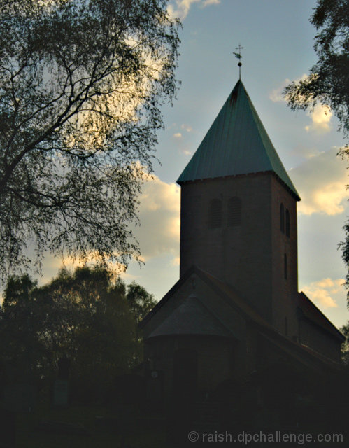
nice sky, need more detail in the interesting part of the shot...
Post actions
Post actions
This is an image in serious need of a levels/contrast adjustment; the church just looks murky and washed out beyond normal
Post actions
Too low of a contrast ration on this one unfortunately ;(
Post actions
wow, love the back lighting.
Post actions
Shadows/Highlights might bring out the church a bit better; love the subject!
Post actions
I like the composition however the shadows are not dark enough.
Post actions
To soft loks out of focus
Post actions
great old church, I wish I could see more detail of the foreground though ...
Post actions
Post actions
Image is very dark, you can hardly pick out any detail in over half of the photo. I like the way the trees frame the shot.
Post actions
I'd like to see just a little more detail in the shadows.
Post actions
I wish that there was more detail in the building.
Post actions
forground is a little too dark.. I'd like to see more detail in the church.
Post actions
The under-exposed front of the building is kinda distracting... like it can't decide to be a silhouette or not. :) I think if you pushed it to that it would do better, or exposed the other way and show more of it.
Post actions
Post actions
I'd have rated it higher but for the fact it seems a bit out of focus and the exposure might have been tweaked. I like the composition though.
Post actions
Post actions
This photo is a bit too dark I'd say... otherwise I like it.






 Add photograph to your favorites
 Add photographer to your favorites


 Photographer found comment helpful.


