You are not logged in. (
log in
or
register
)
−
Challenge Entries
Holy Places
Basic Editing III
168th
170th
Portfolio Images
This image is not part of a public portfolio.
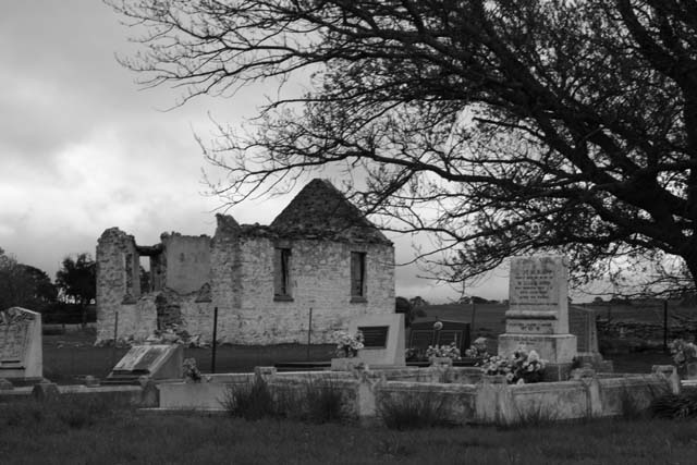
A Place that once was
brettt83
Photograph Information
Photographer's Comments
Challenge:
Holy Places
(
Basic Editing III
)
Camera:
Canon EOS-300D Rebel
Lens:
Canon EF 28-200mm f/3.5-5.6 USM
Location:
Outside of Sydney
Date:
May 6, 2006
Aperture:
5.6f
ISO:
100
Shutter:
60
Galleries:
Architecture
,
Black and White
Date Uploaded:
May 6, 2006
Add photograph to your favorites
Add photographer to your favorites
Shot on an overcast afternoon
Converted to B&W
Cropped
Statistics
Place:
169 out of 250
Avg (all users):
4.9717
Avg (commenters):
4.7143
Avg (participants):
4.7073
Avg (non-participants):
5.1030
Views since voting:
707
Views during voting:
317
Votes:
247
Comments:
7
Favorites:
0
Please
log in
or
register
to add your comments!
Author
Thread
Comments Made During the Challenge
balancedfox
Nikon D7100
Nikon AF-S Nikkor 18-55mm f/3.5-5.6G DX VR
05/15/2006 03:42:07 AM
Post actions
Looks like a really dreary place. I would have increased the contrast to try and reduce the amount of greyness in the pic.
Photographer found comment helpful.
yourbuddyjhawk
Fujifilm FinePix S5000 Z
05/14/2006 01:23:38 PM
Post actions
The composition is great, but the image is too blurry.
abroken1
Canon EOS-350D Rebel XT
Tamron SP AF 28-75mm f/2.8 XR Di for Canon
05/13/2006 08:28:45 PM
Post actions
Just a little brighter and/or more contrast would be better.
swenner
Canon EOS-300D Rebel
05/12/2006 09:25:46 AM
Post actions
Great subject and thoughtful composition. What doesn't work for me is the exposure and the fact that it seems out of focus.
Rebecca
Nikon D80
Nikon AF Zoom-Nikkor 18-135mm f/3.5- 5.6G ED DX
05/11/2006 12:49:13 AM
Post actions
Lovely idea, but too out of focus.
NoellaSue
Canon EOS-20D
Canon EF-S 18-55mm f/3.5-5.6 USM
05/10/2006 04:09:22 PM
Post actions
Seems to be out of focus and low contrast
KarenNfld
05/10/2006 10:23:52 AM
Post actions
Image looks slightly out of focus. It's a little dull, could use some brightening up. Good composition with the tree in the foregeound though.





 Add photograph to your favorites
 Add photographer to your favorites


 Photographer found comment helpful.


