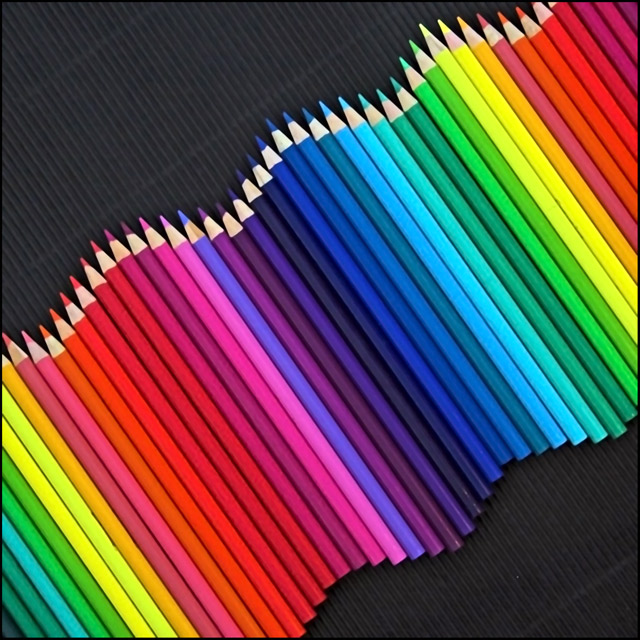
A collection of colored pencils, arranged in a swirling rhythm wave pattern, to give the feeling of "rhythmic movement" in color.
Post details re my image: Needed to send DPC my "raw" origional plus processing details so here they are for you all to read..... I am just so EXCITED re these results and thank everyone for their votes and comments.....
Congratulations to the three "ribbon" winners, and watch out, as I now have the taste for a "ribbon", and I want it badly.....
My processing notes:
File Name IMG_6444.CR2
Camera Model Canon EOS 350D DIGITAL
Shooting Date/Time 2/05/2006 11:20:41 AM
Shooting Mode Program AE
Tv( Shutter Speed ) 1/8
Av( Aperture Value ) 5.6
Metering Mode Evaluative Metering
Exposure Compensation -1
ISO Speed 200
Lens 18.0 - 55.0 mm
Focal Length 55.0 mm
Image Size 3456x2304
Image Quality RAW
Flash Off
White Balance Mode Auto
AF Mode AI Focus AF
Parameters Settings Contrast Standard
Sharpness Standard
Color saturation Standard
Color Space sRGB
Noise Reduction Off
File Size 6596 KB
I then took it to "photoshop", and followed the principles of "Basic" editing re DPC challenge rules.
I firstly went and resized and cropped the image.
I then sharpened the image.
Go to Hue/saturation and saturated to inhanse the color re the whole image.
I then went to Color Balance for the same reasons.
I then went to Brightness and with about a 5 -10% only.
I then went to Noise reduction
Added a border
Then resized for web, upload to DPC site re challenge.
Thank you..... Laugh a little, as today is a good day.....
Statistics
Place: 4 out of 208 Avg (all users): 6.6653 Avg (commenters): 7.6190 Avg (participants): 6.3077 Avg (non-participants): 6.8294 Views since voting: 13302 Views during voting: 383 Votes: 248 Comments: 64 Favorites: 21 (view)
when the last rythm challenge came up i immediatly came to your page to look at this pic, first i though i could reproduce it , but then i realized how tough it was.
great job!
Congratulations Sherryl! I found this image while researching for an entry into Rhythm III.
I am surprised that no one mentioned the incredible illusion of DOF that you created by using only color. To my eye, that is what makes your image so appealing. I also think your background texture is an enhancement, not a detraction as some below have commented. On my monitor at least, it is a subtle texture that acts as a complementary foil for the foreground. It establishes a rectilinear tableau as a reference for the wave. This is a 10 in my book!
Basic image yet so very eye catching and effective. Not sure what the background that was used it, but IMO this image could only
be done better if it were a clean black background. I think that some attention is taken away from the pencils by the stripes in the background, but hey, it caught my eye as soon as I entered your folio.
this photo is so lovely i cant even say how much i like it.. I think your work is inspiering, so colourfull and just so over all lovely. There is only one thing i can see in this photo that i would maybe have changed.. i would have liked to see a solid black background. but what do i know :) keep it up :)
Way to go on your top 5! And what an excellent photo. There were a few similar to this in the challenge if I remember correctly, but this one was by far the best. Really nice work.
A new personal best. Many congratulations, I know you are enjoying being in 7th heaven, may you stay there for a long time.
Oh, and the shot is worthy of the 5th place it got. Marvelous colours in a very good composition.
Shez, this is a beautiful image - very well thought out and very well executed. Nice work and congrats on your very high placement. A ribbon is surely in your future!
Sherryl! Be careful or you are going to end up with a ribbon or two very soon, then your whole life changes - can't go anywhere in the forums without people jumping in and asking for your advice on this or that, PM's at all hours of the night asking for help with processing. You don't want that. ;)
Now for all the others who commented on my background. Most loved it but many said that they would prefer a flat black background and not the corrugated "textured" one that I used. The reason why I used this in preference to a flat black one is answered in two sentences.
First of all I tried the flat black background and the the flat one lost some of the "rhythm" that I wanted to achieve.
Secondly, I love texture, so I personally love the one I chose. I also found that the corrugated card held the rolling pencils in place , so that was a bonus.....
Thank you everyone for commenting and voting on my image.....
All I can say now is "Watch out to those who beat me to my first ribbon, as I now have the taste for it, and will be trying much harder to achieve my dream".
Congratulations, as you are the only one that saw this, as I delibrately put the "purple" colored pencil out of place, re the color wheel, to see if someone would pick up on it, and you did.....
Originally posted by tngrndream:
that one (the purple one) looks like it is in the wrong place. was that intentional. or is it just supposed to be that way. at any rate, it draws my eyes right to it and forces me to remain in the composition.
that one (the purple one) looks like it is in the wrong place. was that intentional. or is it just supposed to be that way. at any rate, it draws my eyes right to it and forces me to remain in the composition.
The pencils seem a bit out of focus and the background texture is distracting. Smooth solid black would have made it better in my opinion. Love the colors and the curves.
THIS is AWESOME!!!! The outstanding brightness of those colors just lifts my spirits when I look at it! The way you have arranged them is PERFECT for rythm. Congratulations on a PERFECT rythm photo!!!
Here's a surprize for you.....
I took the similar shot, exactly same but with different background.. but unfortunately ..
I could'nt send in the entry in this challenge due to some resion.
Good Luck to you I gave you 9-o-10.... cheers Arvinder








 Add photograph to your favorites
 Add photographer to your favorites

 Photographer found comment helpful.


