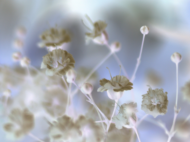
almost straight from camera, save the obvious inversion. Didnt plan it, just tried inverting a load of photos to see which suited.
Will be interesting to see how this goes. Hope it won't stink as much as my Abstract entry
post-challenge edit:
focus seemed fine on positive, but ididn't use any sharpening 'cause it didnt seem necessary. This may have made it appear softer.
Will upload the original later
Taken with extension tubes and OM 70-210mm lens
Statistics
Place: 119 out of 438 Avg (all users): 5.4953 Avg (commenters): 7.5000 Avg (participants): 5.2756 Avg (non-participants): 5.8161 Views since voting: 958 Views during voting: 272 Votes: 214 Comments: 24 Favorites: 0
Comment: The best thing I can say off the top of my head is the members did a perfect critique of this photo.
Composition:
This is a very nicely composed shot. I agree that it a closer crop might have made a difference.
Background/ Foreground
The shallow DOF has the background blurred, it adds to the softness but it also distracts just a little from the shot. My eyes want to focus in the background
Camera Work:
the negative is what makes this shot interesting
Post-Processing:
I think you got it all right in your editing.
My Opinion:
All in all this was a nice picture for the challenge and each challenge helps move us all forward as photographers.
I hope you find these comments to be helpful, thank you for allowing me to critique your picture. If you have any questions or concerns feel free to contact me via PM.
Best of luck in your future photographic endeavors,
My immediate reaction to this shot is favorable. I like the soft texture around the clear center. The colors are soft as well. The combined effect is dreamy...emotionally pleasing. This is particularly appealing because so many of the negative pictures are on the bizarre side (obvious, given the nature of a "negative"). Your negative breaks that particular mold. If I were to suggest improvement it might be experiment with light. I imagine that the original figure had a fairly standard straight-on lighting. Late afternoon light or artificial light from a low vantage point might have added interest. As it is, though, it is perfectly fine and I would have given it a 6 or 7.
Trading Post comment
As I said during voting, I really like the softness of this - I am glad you didn't use sharpening in this case. The colors came out wonderfully in negative, in my opinion. The only thing I can think of that may account for not scoring higher than it did (and it did pretty well) is people here tend to be drawn to bolder, more dynamic color ranges. Really a very nice picture!
this could have been a really good image, but I think a thigther crop would have helped, and a bigger DOF, I really like to see all the fine details in flowerpictures.
the way you made it negative isn't working in the benefit of the image, try usin the hue bar to chane the colorcast, there is a slight tint of pink in the image that I find really distracting.
my first thoughts on this one are that the bg is way too busy. ifn you could isolate the flowers (which are very pale) a bit more from the bg i think it would work gallons better. the lack of contrast, yes i understand you probably intended it, is making it difficult to see any details in the flowers that you want us to see. that is what makes them fragile. but it is also what makes the viewer skip looking at it because it is too hard to see the details. i think that people want "POP". that is all i have been reading in most of the critiques.
I think this is a nice image that works well in negative. It really does have a fragile feel to it. I may have preferred a tighter crop, to get rid of a large white element at the top. Focus is kind of soft, but I think that works well with this image. There is a slight sense of business that may have prevented me from voting higher.
Trading Post...
I like the softness, but probably most don't. I always tend to give shots like these higher scores because they're "feel good" photos. The title suits well. If I had voted in this challenge I would have given this a 7 or 8.
[[Trading Post]]
This strikes me as a very gentle, relaxing image, which usually means it doesn't have a strong subject or theme. It is in its own way "abstract", but it's still recognizable, so it's not a true abstract. The out-of-focus stem right in the center steals my eye so quickly; it would have helped a lot to have just physically removed it. Apparently it was the closest thing to the lens??? A little more black (increasing the contrast) would possibly have made it stronger, but it would have ruined the "relaxing" part. I like it, though!
Right off the bat my eyes are drawn to the white blurry spot on the lower mid left corner. The flowers didnt really stand out - the colors and shades just kind of blended together. It did have a kind of spiritual (bad choice of word but couldnt think of another one) feel to it, but as a negative I just didnt think it worked out great.
--Trading Post Comment--
Even without the title, I get a very fragile feeling from this shot. It is very well composed and the exposure looks great for negative. IT looks like the focus may have been off a bit, thus the lower score than if it weren't. Still, a very nice negative image. I didn't vote in this particular challenge, but it would have been a 6.
I expected that photos that were more graphic art in nature would be the ones that looked really good for this challenge. You definately proved me wrong on that theory, this is great. The negative tones are cool. Beautiful floral!
I would have liked to see just a smidgen of more contrast - just enough so the point of the title would not be lost. Like the mute colours. Wait! I just put the brightness down on my computer to 0. Ahh that's better.I still think a little little bit of contrast wouldn't hurt. Especially since the DOP is very selective here (IMO the DOP chosen adds to the fragile idea)







 Add photograph to your favorites
 Add photographer to your favorites

 Photographer found comment helpful.


