My image was shot using the raw program, with my wonderful new Canon EOS-350D camera.
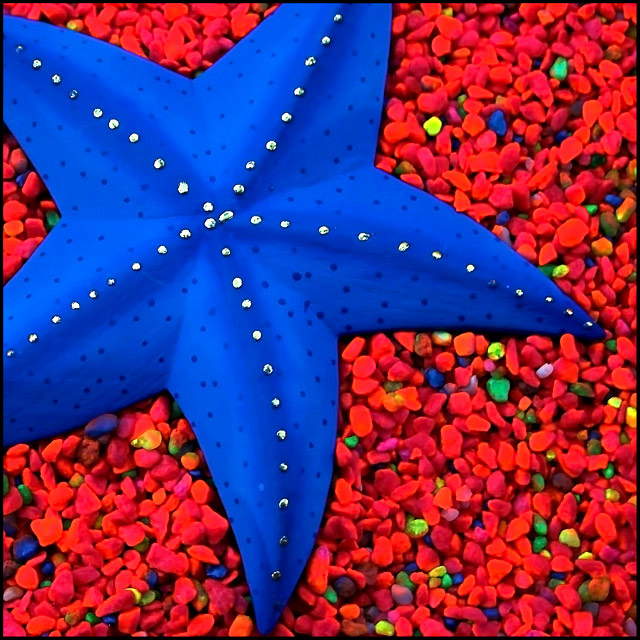
This was such a huge "fun" project for me, as I knew exactly what I wanted to do. I definately wanted to use the "complementry", colors of "orange and blue", for my image.
My problem started, as I had the blue starfish on my wall, but nothing orange.
I decided to go to all the aquarium shops around town, in search of some orange "fluro" small stones. No one had any, except mixed with other fluro colors.
My dear husband spent a couple of hours sifting through the small stones, so as to get all the orange ones for me. We were so disappointed, as we only managed to fill one cup of orange stones.
My next idea was quite messy. I went out searching for some orange "fluro" spray paint. I came home and then started spraying, (yes I used a mask) the various colored stones orange.
This took a whole day, as they had to be spread around so as to spray the other side as well, and also get the chance to dry.
I finally had what I needed, so I was able to set up for my shoot.
I laid the fluro colored orange stones, with a small sprinkle of other colored stones for contrast, onto a tray. On top of that, I then positioned the blue starfish, and this image is the end result.
I had a ball, and I am very happy with the result.
Statistics
Place: 71 out of 287 Avg (all users): 5.7795 Avg (commenters): 5.4583 Avg (participants): 5.2125 Avg (non-participants): 6.0402 Views since voting: 1947 Views during voting: 353 Votes: 254 Comments: 34 Favorites: 5 (view)
This is an awesome composition, the colours really pack@a punch.
This was one of the challenges I didn't have time to vote on, so I'm having the pleasure of viewing this one only now.
I love the strong colors in this shot, and I think the composition works very well. The silver dots running along the ridges are so neat. I like the sharp focus and excellent smooth lighting over the whole image.
nice composition but the colors seem over the top to me--the gravel is not nearly as sharp as it should be and looks totally oversaturated to the point where it's working against the image.
Ohmygoodness!! This photo is incredible! I've never seen such a vibrant blue. And contrasted with that vibrant red, the starfish looks 3-dimensional. I hope this does well because it is an amazing, strking photo!!!
4 - Like the concept, composition and detail in the star. The 'orange' (which looks like you've tried pp to tweak) not working in my opinion. The pebbles also look a little grainy or 'something'.
humm.. the colours look to fake for me.. and its blue and orange not red. Im sorry this isn't doing it for me.. edit: hope you are ok with me giving you a low rate, nothing personal!





 Add photograph to your favorites
 Add photographer to your favorites

 Photographer found comment helpful.


