| Author | Thread |
|
|
04/26/2006 05:58:19 PM |
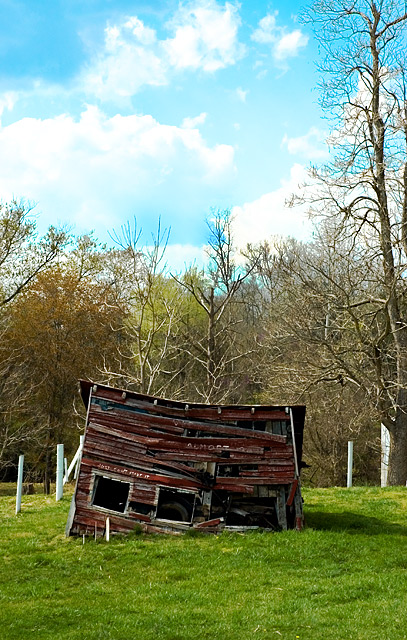
A few things, although I like the picture and idea overall.
1) The composition is so centered. Boring. You know better than that.
2) The building is awesome, but is just a bit dark. We lose the great detail of all the wood planks.
3) I think you did a good job on the sky, but to be honest, the tone in the middle is my least favorite color of sky. It looks like faded slides to me. That's just a nitpick though. I think you did well with the sky.
It's mainly the centered composition which got you here, I think. |
|
 Photographer found comment helpful. Photographer found comment helpful. |
Comments Made During the Challenge  |
|
|
04/25/2006 11:28:48 AM |
too straight forward. no depth. no feel. and the sky colors are way off.
nice subject though. keep trying. |
|
| Photographer found comment helpful. |
|
|
04/25/2006 09:51:23 AM |
|
Your WB is off here... too much of a blue tint. Oterwise a nice composition. |
|
| Photographer found comment helpful. |
|
|
04/22/2006 09:36:00 AM |
|
Great sky.....nice image as well..... |
|
| Photographer found comment helpful. |
|
|
04/22/2006 12:57:05 AM |
|
Wow, great colors and good subject! Nice |
|
| Photographer found comment helpful. |
|
|
04/21/2006 06:11:55 PM |
|
Curious about what the writing says.... |
|
| Photographer found comment helpful. |
|
|
04/20/2006 12:34:05 AM |
|
| Photographer found comment helpful. |
Theme:
Classic /
Light /
Dark
Home -
Challenges -
Community -
League -
Photos -
Cameras -
Lenses -
Learn -
Help -
Terms of Use -
Privacy -
Top ^
DPChallenge, and website content and design, Copyright © 2001-2026 Challenging Technologies, LLC.
All digital photo copyrights belong to the photographers and may not be used without permission.
Current Server Time: 10/13/2026 12:32:58 AM EDT.






 Add photograph to your favorites
 Add photographer to your favorites


