A few things, although I like the picture and idea overall.
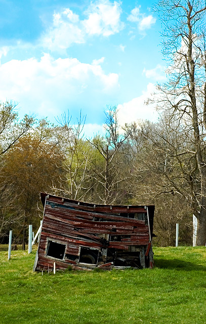
1) The composition is so centered. Boring. You know better than that.
2) The building is awesome, but is just a bit dark. We lose the great detail of all the wood planks.
3) I think you did a good job on the sky, but to be honest, the tone in the middle is my least favorite color of sky. It looks like faded slides to me. That's just a nitpick though. I think you did well with the sky.
It's mainly the centered composition which got you here, I think. |






 Add photograph to your favorites
 Add photographer to your favorites

 Photographer found comment helpful.


