I predict 5.4, my husband says, "At least 6, or I don't know anything."
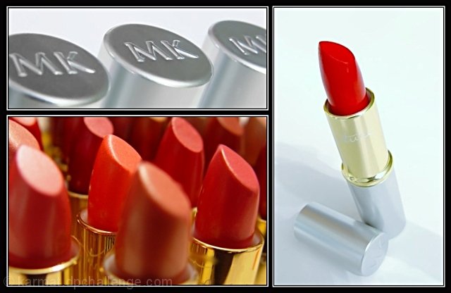
Basically, the shots were cropped, brightness/lightness adjusted, contrast, noise, etc. Then, added a border to all of them, and put them on a black background.
The other one I like a lot better -- the background is the lipsticks with the opacity turned way down in the background, with the other pictures onit. I was afraid it would violate border/artwork rule and more than three pics.
I am a MK Ind. Beauty Consultant, and those are all *my* lipsticks. Actually, they are "sampler/testers" that women can use on their hands to see if they like a shade. :)
Statistics
Place: 53 out of 234 Avg (all users): 6.0511 Avg (commenters): 7.5238 Avg (participants): 5.7969 Avg (non-participants): 6.2740 Views since voting: 1237 Views during voting: 425 Votes: 274 Comments: 24 Favorites: 1 (view)
6 - Good use of triptych to 'showcase'. Criticism; not much, difficult with the size restrictions anyway, but perhaps 'sharper' on all, more 'fore focus' in the lower left shot and slight contrast/lighting(?) adjustment in 3/right shot, may have made this better in my opinion. Good 'commercial' aspect.
WOW. All I can say is QUALITY. Very, very nice, are you sure you didn't scan this from a 2-page ad in Vogue? ;-) Perfect lighting, color, exposure, etc. Cool, original idea for arranging the triptych. Nice variety of angles.
Nice. Could be a sales postcard or mailer for Mary Kay! The only thing I don't like is the out of focus lip stick in the foreground of the open tubes of lipstick.
A great combination! Very well executed - nice photos, simple & elegant borders, perfect arrangement. Definitely and advertising-esque collection. Well done.
I love this, and I'm not even a girly-girl makeup kind of woman. :) Would be excellent as a poster in a department store, or something. Balance is good, I love the colors, all three images are well-done, and I like the focus in the bottom left frame. 10.





 Add photograph to your favorites
 Add photographer to your favorites


 Photographer found comment helpful.


