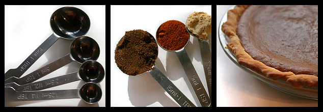
i dont like the color cast shadows in the 3rd panel... a suggestion would be to select that area and desaturate it slightly or make it cooler (photo filter -> cooling filter or blue)...
Ah, I like that you have a 'story' here. There is a much stronger concept in this piece than in a great many in this challenge. I think you could have done a bit more with your measuring spoons - look at the angles from which the three shots were taken. the measuring spoons are all straight overhead, but the pie is at a 45 degree angle. I think it would have been compositionally stronger to have the leftmost shot of the spoons also taken at 45 degrees, which would give you a nice symmetry of perspective: 45 - 90 - 45. It would also have been nice to see some more consistency in the lighting. The pie shot has a lovely soft shadow - I'd like to see that soft lighting on the spoons as well. (7)
6 - Good idea and execution. Criticism; definitely at least 640 width, enabling 'larger squares' would have made this even better. Coloring is good, good detail (even at this size) in the spices and the pie. Maybe not so tightly cropped on the right in the center frame, #2. Framing works. Nice and 'neat'.





 Add photograph to your favorites
 Add photographer to your favorites


 Photographer found comment helpful.


