Author Thread Comments Made During the Challenge
Post actions
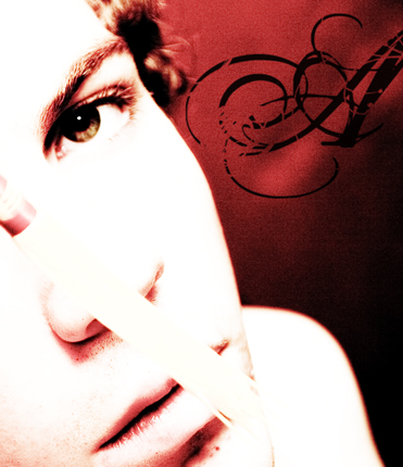
In my opinion, that thing (Can't see what it is) in front of the nose is ruining this picture that I would find good otherwise.
Post actions
I don't know what the white thing in front of the nose is, but it is very distracting, to the point of destroying a very good photograph.
Post actions
The more I look at this photo, the more I like it. Well done. My personal pick for top ribbon contender. :) Good luck.
Post actions
looks like an album cover
Post actions
I don't like the fact that it is so over exposed.
Post actions
Interesting composition here, but the over exposed look doesn't appeal to me.
Post actions
way over contrasted and way too post edited..
Post actions
Post actions
Post actions
What is the white tray of the face.... ? Its disturbing this otherwise well done shot.
Post actions
when you incorperate rules of thirds to this photo, you really made the eye "pop" my eyes are drawn to the eye. good job. 10
Post actions
I like the picture, but what's in front of the face?
Post actions
Nice toning here. Unfortunately, the main subject is so overexposed there is significant loss of facial detail and I cant tell what is in front of her face - at first I thought she had something sticking up her nose! In addition, the focus seems to be off. This was a good idea, but isn't as technically strong as it could be.
Post actions
Nicely done. I like the contrast and red tones. Would have done without the stick/pen? through the face.
Post actions
Maybe I am missing something but this would have been great without the "thing" across the face, I just cant make it out so am not sure what its purpose is.
Post actions
I like the overexposed feel of this. Interesting angle. The script A is nice too!!! Great focuson the eye.
Post actions
I really like this photo, especially the composition and the colour contrast......but what is that across the centre of the subjects face????





 Add photograph to your favorites
 Add photographer to your favorites


