I have studied your image and have the following to offer:
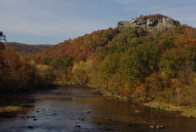
Composition/perspective - the ratio of sky to land is good in this shot. The water and rocks help to break up the view and offer a few places to focus on. If the rock outcropping was a little lower in the shot, the little extra sky wouldn't hurt. There is a branch protruding on the left side I find a bit of a distraction and could have been cropped out all together or more of the tree included to make it part of the scene. The focus seems a little fuzzy or perhaps a bit of sharpening could have been applied. It appears you are over the water, perhaps on a bridge. It may have been a stronger image if you were at water level. I assume that is a fisherman in the distance, again it would have been a stronger image if he was more prominent in the scene.
Color - the colors seem a little flat or muted. There are a lot of autumn colors present in the scene that are just not strong enough. Boosting contrast and saturation some may have helped to bring these out more.
Lighting - natural light...the left side of the scene is a bit dark compared to the right hand side of the scene. Changing perspective left or right would have changed this and helped to bring it in balance or eliminate it. A different time of day may have helped as well. The sunlight appears a bit hard. Softer light would have helped with the colors (see above).
Challenge requirements - the challenge was for a landscape and this certainly fit the requirements. Your choice shows an interesting mix of elements that provide for a lot to view. The fisherman is a nice added touch.
Overall/my opinion - this is a nice scene that with slightly different processing could be made much stronger. I wish the fisherman was a stronger element in the picture which would have gone better with your title. The image has potential.
Thanks everyone for your comments, they were very helpful. This was my first challenge entry and I learned a lot. I did go back and tweak the levels, contrast and brightness and it made a huge difference. I wasn't sure how much Basic Editing allowed me to tweak the picture so I left the it pretty much as it came from the camera.
Again everyone thanks for your comments.
Good picture. Some of the comments indicate grayness in the photo. I don't see that at all. Could it be some of the monitors are not set correctly? This picture and all the others came across my monitor with good color contrast. I see no grayness at all. Just wondering about those comments. Thanks. Debra
these trees could be so beautiful but they seem to be lacking something, they are somewhat dull, perhaps some post processing would help. same with the sky.
however, i love the peacefullness of the photo. the fisherman are definitely a great touch.





 Add photograph to your favorites
 Add photographer to your favorites


 Photographer found comment helpful.


