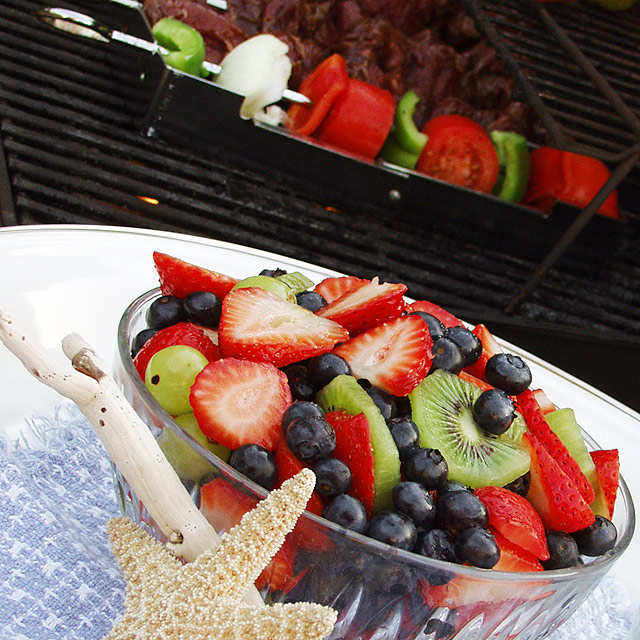
Wonderful color, great choice of DOF. Not sure about the funky angle but I think it might just work. The starfish and piece of wood seem very out of place for me, and a tablecloth that covers the whole table would've just perfected the scene. Still a pretty good shot. (6)
I love the foreground but not the back. I'd prefer this as a landscape picture cropped from the top to just below where the plate touches the left edge - to make a striking diagonal of black at the top left. That said, I do appreciate that your chosen orientation works better with the magazine in question.
Perhaps more attention on colours/ and surfaces for background objects would make that area as appealing as the front?
This is a very good picture. The color and the lighting is excellent. The star fish ruins it for me. It seems to be just put it in there for the heck of it. I think this would be the winner if you left out the foreground (starfish) and the shish kebob in back and highlighted the top of the fruit with the black background.
A great choice of subject and composition. I think the perspective/angle is unnecessary. I would have liked to see this image shot straighter. Good enough to eat!






 Add photograph to your favorites
 Add photographer to your favorites


 Photographer found comment helpful.


