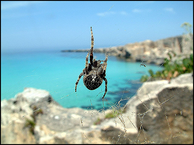
I really hate spiders but this is such a superb image that I'm still giving it a 10. I often like shallow DOF but here it just blows me away - a perfect choice. It creates what looks like a painting behind the web and really evokes the idea of a home in the sunny mediterranean or caribbean.
I love the photo - just think it might not fit the needs of that particular magazine... btw, the orientation means little - not all mags have one shot, full bleed to the edges.
House Beautiful = interior design magazine. This = at best a poor pun.
If you were going to do a pun like this, you should have found a more attractive spider web. The background looks attractive but as the focal point is on the spider and web and the background is blurred that doesn't much help.
Better still, if you wanted to enter this shot into this particular challenge, you should have found a magazine that might have accomodated it. I would have thought more highly of it. I don't care for spiders and if I look at a web I'd like it to be pretty and iridescent but I would at least have felt it was truly on topic.
Good pic of a spider and a wonderful bg, but I don't think that House Beautiful would put it on the cover. Too many folks fear spiders. Also there is no house in the picture. Still rating pretty high though cuz I like the pic.






 Add photograph to your favorites
 Add photographer to your favorites


 Photographer found comment helpful.


