Yeah... you got robbed dude. Just goes to show: people vote higher for things they "recognize". Baskeball shots have been done millions of time. Sure it's a nice shot. But does it belong at number 1? Not compared to your shot. (ok ok, not nice to compare... but sorry, it's true! You deserved it.)
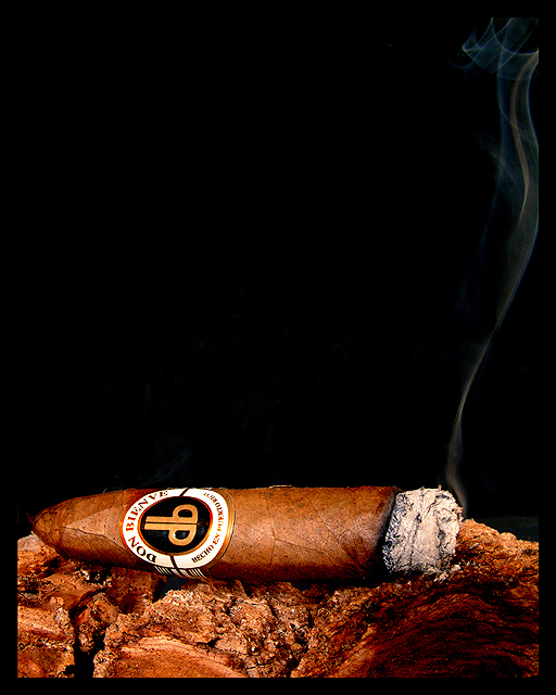
Beautiful tendril of smoke, lovely rich colours, good lighting and nice focus. I like that even with magazine text this image would still allow for a feeling of negative space. 10
I like your setting for a unique picture, the only thing that I would change is to try to get a wooden base that was not as close in colour to the cigar.
The lighting is nice, you reproduced the brown hues pretty well. The wood or whatever this cigar is resting on is kind of hard to make out. I would remove it from the picture next time, too confusing.
Great example of a picture that would make a great magazine cover just as is. Great lighting, composition, and enough room for text. The shadow on the lower right bothers me just a bit but still an excellent photo.
Precisely the type of thing I've seen on Cigar magazines. I don't know yours in particular but other versions have had items like this. Lots of negative space at the top seems common, lots of room for the text. Close-up to show the brand and style is also common. I can easily see it. Good job.
What a great shot! perfect focus and lighting, and excellent DOF. The black background really helps to highlight the cigar smoke. The onli knitpick I have (and it's a very small one) would have been to either move the cigar to the left or crop less off the right, just so the smoke wasn't cut off. But like I said, the picture absolutely excellent as is and definately one of the week's best.
I love the lighting on this photo. It really highlights your subject. I can easily see it as a magazine cover since you have left plenty of room for title and article information. I didn't notice the smoke coming off the cigar at first but it's a cool little detail that adds interest. A very nice shot. One of my favorites!
Perfection! I used to subscribe to this magazine, actually. I can definitely see this - if not on their cover, at least inside somewhere. Gorgeous lighting, fantastic composition, beautiful rich tones. Makes me want to light up a stogie and have a good glass of single malt. :) 10
This is a great photo that really fits the challenge... plenty of space for type, very well done. Not sure I would have put the black border, but I don't think it detracts substantially from the photo... The whisps of smoke produced by the cigar are pretty much "picture perfect" very nicely done!
Simple and classy. I have no idea if that's a good brand of cigar or not, but it's something I'm sure would appear on your chosen magazine. I think the cigar is on some bark or maybe it's the leaves or something, but whatever it is I like the texture and color, very complimentary to the cigar. The trail of smoke leads upwards to where I assume the title would be. Great image!







 Add photograph to your favorites
 Add photographer to your favorites

 Photographer found comment helpful.


