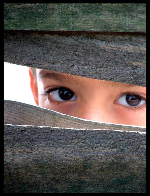
I think this shot suits a photo mag cover because of its impact and layout. The eyes are inviting/intriguing enough to encourage sales, It's technically sound (essential for a photo mag), and also the clear areas at the top, bottom and left would be good for titles and copy.
Statistics
Place: 8 out of 232 Avg (all users): 6.9184 Avg (commenters): 7.9231 Avg (participants): 6.7623 Avg (non-participants): 7.0732 Views since voting: 4781 Votes: 245 Comments: 29 Favorites: 14 (view)
Thanks for all your kind comments - here's my respone to them. Firstly I take on board the comments about the eyes being out of focus - I was simply just unfortunate! I had about a second to take the shot as it wasn't posed - the boy simply looked through my fence towards my son who was playing there and then was gone. However, I'm not sure I would want it different as I think it isolates the boy as an "outsider" re: the title even more. Basically I consider myself lucky to have grabbed the decent framing in that time. Also, I perhaps would remove the reflection in the left eye in spot editing though certainly not all of it - just the line across the centre. I'll settle for 8th any day!
One of my favorites in this challenge. So wonderfully composed with lots of space that can be used for text, but is just as interesting w/out. Those beautiful huge brown eyes peeking through ... if I had taken this it would be hanging on my wall. You might very well get a ribbon for this :) (10)
Brilliant, great textures and composition. Good concept. Really nice skin tones. Only thing that spoils it are the eyes... the reflection of the wood in her left eye cuts across her pupil, lessening the impact of the photo. 9
thats cool =) nice shoot.. however, i would choose another magazine.. something about reports, news, child issues, etc anyway, its a nice shoot :D congrats.
Nice use of compositional focus here. This does indeed suggest "practical photography" to me and makes me want to open the magazine and find out all about it.






 Add photograph to your favorites
 Add photographer to your favorites

 Photographer found comment helpful.


