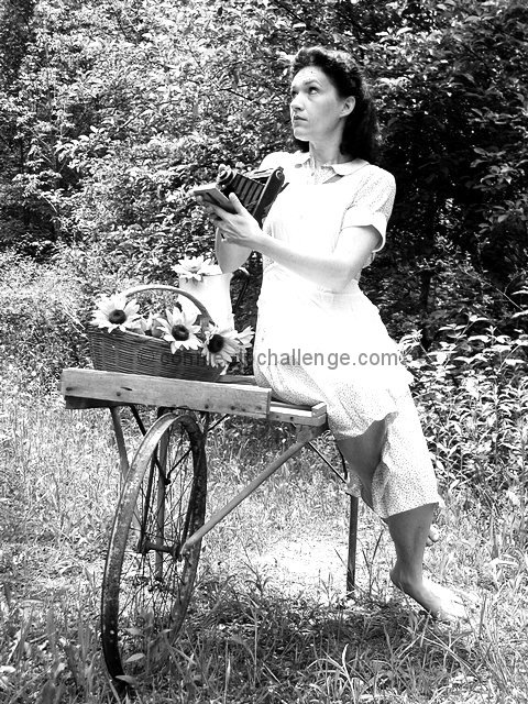
This is a photo of myself holding my grandmothers camera. The clothes i have chosen to wear are vintage, I wanted to give the picture an old look. I shot it in color and converted it to black and white and adjusted the contrast.
Statistics
Place: 33 out of 153 Avg (all users): 5.9833 Avg (commenters): 6.8571 Avg (participants): 6.1053 Avg (non-participants): 5.8720 Views since voting: 2619 Votes: 239 Comments: 36 Favorites: 4 (view)
I really like the concept! Great idea. I think the model needs to be shifted to the right in the frame. That and the blown out front of the dress really knocks it down a few points though.
I like the old-fashioned feel to this portrait. One thing I would change about the model is the profile of her face. Having the tip of her nose line up with the edge of her cheek looks a little odd. She could turn her face a little more towards or a little more away from the camera to prevent that.
She really looks the part. Nicely composed, and pretty good tones. The overexposure on her foot and dress is a bit of a negative, and the wheelbarrow, though it's a nice prop, doesn't really fit for me (especially missing the tire), but the latter is really reaching. I expect this to do very well.
love the idea, wish light wasn't so harsh on her - the cart,flowers and her being bare foot make me think of soft and subtle - not almost glowing/ghost white. good use of props!
I'm not an experienced photographer but IMHO what upsets the balance of this photo is the over brightness of the models dress. It seems to distract from her face. Lovely photo tho and lovely model:-)
A neat idea. It seems a bit overexposed to me, though you may have wanted it like that. I think it would have been nice to see the pattern on her all of her dress and not just at the hem
With the clutter of the background it's hard to tell what exactly is going on here. I see the camera, it's just not as visible as it could be. Perhaps if she held it differently.
This is very nice! The framing, composition, and subject matter is great... i think the lighting is a little harsh on the white dress however.... good work!
Great composition, subject, and background. On my monitor, the highlights of the dress a little washed out. This photo could be a ten with a little work.
This is a well thought out photo. I really like the concept. The white areas (the dress front, sand and foot, are a little over exposed due to the sunlight I think. However, this is a really nice photo. ( 8 )
I gave a high score for originality and setup. I wish that her dress hadn't gotten blown out. I'm wondering if an 81A or B filter might have allowed the texture of the foilage to come through yet give just enough dynamic range to also get the dress. Overall, very good job!






 Add photograph to your favorites
 Add photographer to your favorites


