Author Thread Comments Made During the Challenge
Post actions
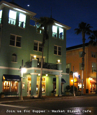
The difference between the light and dark zones is too great and so you are washing out some parts and darkening others parts..
Post actions
If cropped differently the upper floor wouldn't show, which is too bright and draws attention from the street level.
Post actions
:) Maybe a head on shot or a closer view on the angle would give a little more impact to this cafe. Also, it seems quite a bit out of focus.
Post actions
Could be an interesting subject. Would need to be straighened and focused more sharply for me to take it off the postcard display.
Post actions
Is that the moon up there in the sky? You chose the right shutter speed for this image, those lights are bright but not blown out at all, good. I would have tried a few different variations on text style though, the one you chose looks a little bland.
Post actions
good composition but the shot is a little fuzzy and noisey
Post actions
The composition is juuuuuuust crooked-looking enough to make me feel like I'm the one that's aslant, slightly. Kind of uncomfortable. The lighting feels odd, too. Plus, I can't see it on a postcard, and since that's the theme ...
Post actions
I don't like the choice of text but the picture itself is nice. For a moment I thought it might be in South Beach (Miami, FL)
Post actions
Excellent theme - the only trouble is the grainy texture...
Post actions







 Add photograph to your favorites
 Add photographer to your favorites


 Photographer found comment helpful.


