| Author | Thread |
Comments Made During the Challenge  |
|
|
05/09/2003 04:37:35 AM |
|
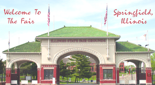
It's postcard stuff alright, well done. Only thing I'd change would be to boost the saturation a little to bring out the colors more. |
|
 Photographer found comment helpful. Photographer found comment helpful. |
|
|
05/08/2003 02:40:37 PM |
|
Very postcardy, and technically speaking a beautiful shot. The only thing that kept it at 9 and not 10 for me was a lack of a certain spung, that magic 'Wow!' spark. But I have to save 10s for *something*, right? :-> The colors are also a little washed-out-feeling. Maybe if the whole were a little richer, less bright and gleaming-white (drop the gamma correction slightly, maybe), it'd have topped out for me. As it is it looks a little like the photo's faded. |
|
| Photographer found comment helpful. |
|
|
05/07/2003 03:37:41 PM |
|
This sure meets the challenge. Looks like a postcard to me. :-) Good luck! |
|
| Photographer found comment helpful. |
|
|
05/07/2003 10:34:56 AM |
|
Nice picture in general, but a tad overexposed I think. |
|
| Photographer found comment helpful. |
|
|
05/06/2003 08:11:29 PM |
|
Wonderfull symmetry in this shot. I find the image way too washed out. You have wonderfull colours to play with and they're down played a bit too much. This could be fixed by playing with Levels in Photoshop or Histrogram adjustment in Paint Shop Pro. Still worth an 8. Jacko. |
|
| Photographer found comment helpful. |
|
|
05/06/2003 04:37:44 PM |
|
Could have been alittle less exposed but not a bad pic. |
|
| Photographer found comment helpful. |
|
|
05/06/2003 05:05:50 AM |
|
Looks a little too wide in dimension for a postcard, and looks like it could use some levels adjustment to get rid of that hazy look and bring out the colors. |
|
| Photographer found comment helpful. |
|
|
05/05/2003 05:34:42 PM |
|
Ovexposed - and since it is symmetrical, it should in my oppinion be perfectly symmetrical (the crop on the right and left to be identical) |
|
| Photographer found comment helpful. |
|
|
05/05/2003 12:32:42 PM |
|
This is hazy, and over exposed. Some type of filter (circular polarizer) or faster shutter speed... |
|
| Photographer found comment helpful. |
|
|
05/05/2003 10:42:57 AM |
|
Picture is very light and colors washed,aome photoshop work woul make it nuch better! 4 from me! |
|
| Photographer found comment helpful. |
|
|
05/05/2003 10:07:12 AM |
|
Looks straight out of the thirties. Great job! 10 |
|
| Photographer found comment helpful. |
|
|
05/05/2003 09:41:11 AM |
|
I think this needs to be darker, I think the sky lets you down a bit here...... |
|
| Photographer found comment helpful. |
|
|
05/05/2003 01:26:31 AM |
|
This seems like the brightness was increased a bit too much. I like the shot though and the text fits along great. It'd have been really neat on a windy day with the flags blowing. Overall this would be a great postcard, meets the challenge wonderfully, well done. |
|
| Photographer found comment helpful. |
Theme:
Classic /
Light /
Dark
Home -
Challenges -
Community -
League -
Photos -
Cameras -
Lenses -
Learn -
Help -
Terms of Use -
Privacy -
Top ^
DPChallenge, and website content and design, Copyright © 2001-2026 Challenging Technologies, LLC.
All digital photo copyrights belong to the photographers and may not be used without permission.
Current Server Time: 10/16/2026 12:54:07 PM EDT.





 Add photograph to your favorites
 Add photographer to your favorites


