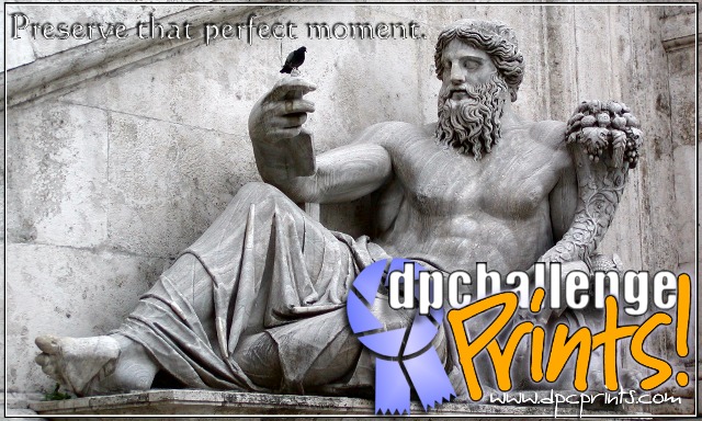
Thanks to all of you for your comments. This is one of my favorite photos - the original, uncropped version can be seen in my portfolio, under Black and White. I tend to agree with those who commented on the font choice of the URL. That probably wasn't my best alternative.
Congratulations on getting a ribbon. The bottom chunk of text looks very professional and pleasing to the eye. The drop shadow at the top is a little distracting but overall it a nice design. Interesting choice of background photo!
This is my favorite, but the problme is the font used for "Preserve that perfect momen". The font is in my opinion a bad choice and the text is lost in the background. Is the good path but must to be improved.
I think this treatment is an interesting one - though I think it would work best for a promotional postcard than a sticker (suggestion to site admin?).
Not keen on font choice for text along top or for website name.
I don\'t see dpc prints as being about preserving the moment so much as about finding the right print to hang on my wall or about selling my prints to others.
6, Kavey
This design seems to be conflicted to me. I mean - the text in the upper right is ok though a bit hard to read. The COLOR in the lower right really bugs me for this design, but that's ok - I guess it's that half the text is coveirng a quarter of the statue.
I like the photo in the background, but I dont think the slogan in the top left is easy enough to see. Also, I like the idea of mixing up the letters in 'Prints!' but it seems too busy and crowded down in that corner now.
I love how this one pops out at you. I wish the url were a little more readable, and I'm not 100% convinced of the connection from the statue to prints, BUT I gave you a 9 :)





 Preserve that perfect moment.
 Add photograph to your favorites
 Add photographer to your favorites


 Photographer found comment helpful.


