Wooohooo! My first Ribbon. And no, I don't care that there were only 22 entries, more people should've submitted ;) Thanks for all the comments everyone.
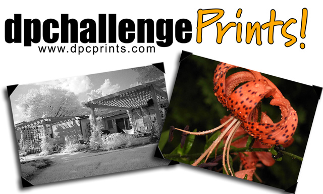
I like this design, the photo corners are nice, but I'd prefer them to look more like traditional photo corners. There should definitely be more white space around the outside of the sticker. Good stuff.
Simple design. Straight to the point. B/W & color prints shown in framed state explain indirectly what the PRINTS word in yellow means. The url shows where to go for the prints. The white area could have been textured to add richness to the sticker as a whole. So a minus point there.
I like this design, with colour on the right and b&w on the left. I do think that the images are slightly too close to the edge tho. The overall simple design works well.
This is a very nice design. If printed, you would probably need to adjust your images so they weren't falling off the sticker. Otherwise a pretty effective design.





 Sticker
 Add photograph to your favorites
 Add photographer to your favorites


 Photographer found comment helpful.


